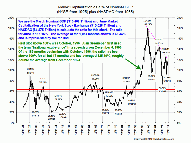
Its time to rerun the latest version of this classic Chart Store work showing the relationship between total Market Capitalization of NYSE + Nasdaq relative to national GDP.
The compression that we have been experiencing since 2000 is still underway — I haven’t the foggiest when it is going to end.


What's been said:
Discussions found on the web: