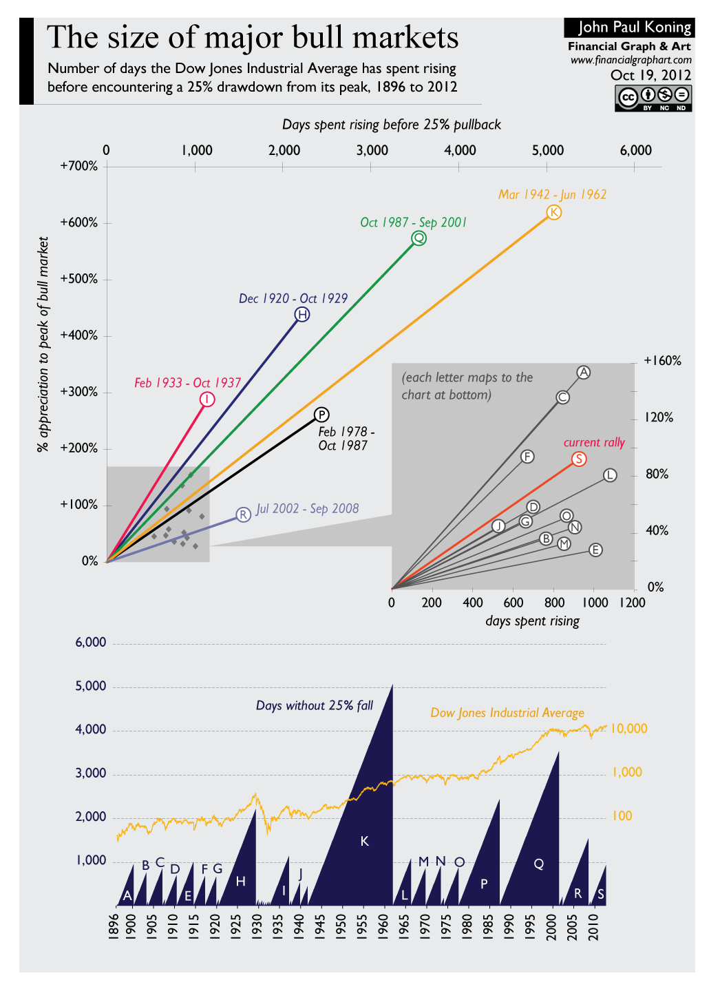
click for ginormous graphic

Source: financialgraphart
Back in 2009, we ran this Financial graphart‘s terrific chart of Bear Market Comparisons, 1929-2009. When we put it up way back in early February 2009, there were still 2 weeks left in the 2009 bear. (Its updated here).
Well, in what might not be too auspicious a sign, today we run a new chart called “The Size of Major Bull Markets”. It’s similar to the prior one, only flipped around.
Source:
John Paul Koning
Financial Graph & Art, October 19, 2012
www.financialgraphart.com


What's been said:
Discussions found on the web: