I mentioned at the end of the Summer that I was beginning a site redesign. The refresh is nearly complete — the interior design is mostly done (see PDF below the jump). This is the part of the design that holds the written content and graphs.
It is much cleaner, easier to read and navigate. The first post will be fully expanded, but the next 9 subsequent posts will be headline and a sentence or so. This will load MUCH faster than 10 posts with all of their graphics, charts, text, etc, having to load also. Its about a 4X speed bump. All of the current functionality — email post, print, search, RSS, etc — will also continue. (I have been getting so many RSS Scrapers I may shift back to partial RSS feed from full post to thwart the splogs).
~~~
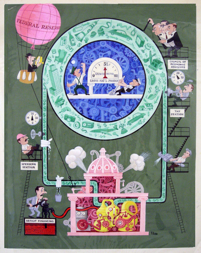
The header and side background are still works in progress — we started with the Jim Flora art work Money Flow as the inspiration for the design (I secured the digital rights and have the original). Then we updated it into something more modern while still retaining a little retro flavor. (So far, the TBP logo is still the same).
As mentioned, we are doing away with the 4 Tab design (its old and boring). In its place, we are using Icons to replace/identify the 4 subjects previously in Tabs: Think Tank, Video, BookShelf and Weekend. Click on anyone of these and you still get the full feed of that tab subject.
Overall, the layout is much cleaner and lighter.
Site redesign inspired by Money Flow
click for larger delightful artwork; (ginormous version here)

Click to open PDF of interior:
TBP Interior Redesign (PDF)
Click to open graphic
>


What's been said:
Discussions found on the web: