Click to enlarge

Source: Fusion Analytics
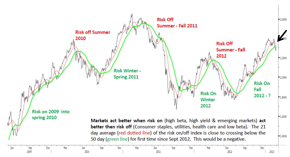
Fascinating chart from my partner Kevin Lane — he works on the Institutional side and is the creator of the algos that drive FusionIQ.
Kev created a RiskOn/Risk Off chart by plotting High Beta, High Yield and Emerging Markets versus Consumer Staples, Health Care and Low Beta names. When risk appetites are higher, it is reflected in the ratio moving higher. When fear levels rise, and sector rotation switches to the defensive names, and the ratio heads lower.
We do regular conference calls with subscribers of FusionIQ, and this is one of the charts we discussed on our call last night. You can download the full slideset here.
Source:
Fusion Analytics
Equity Market Research, February 28, 2013


What's been said:
Discussions found on the web: