~~~
I am a sucker for a good piece of digital media, and CoreLogic hits me right in the sweet spot.
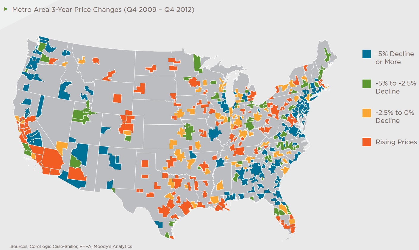
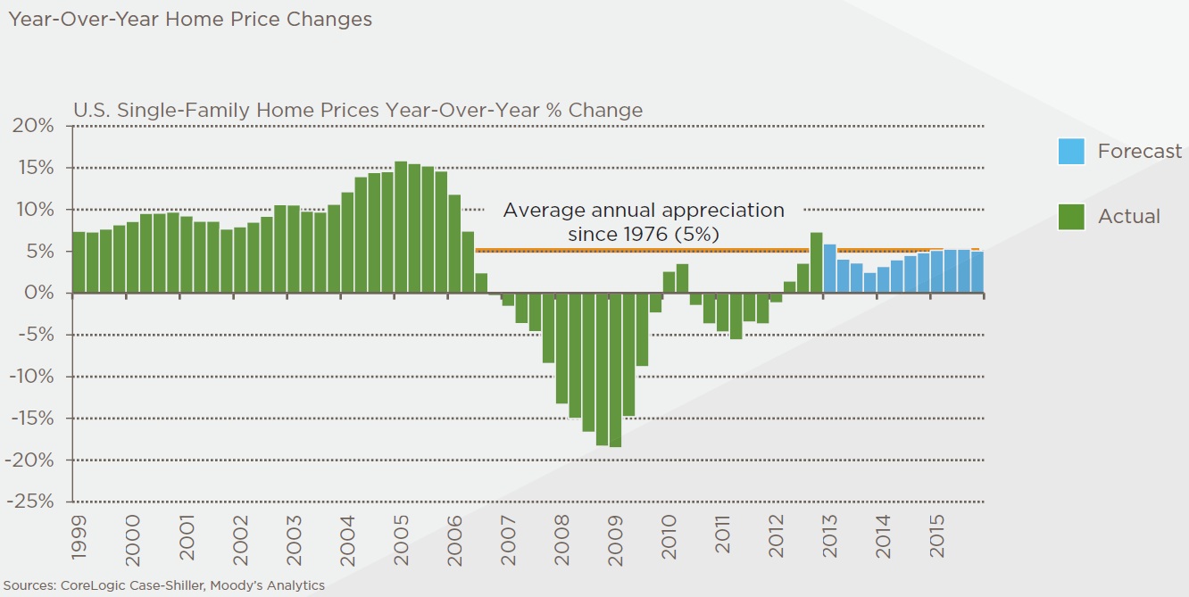
The map and chart above provide some great context on the state of the Housing market — were we have been, how silly things got circa early 2000s, how bad they got circa mid-to-late 2000s, and the recent improvements.
Source:
Case-Shiller Indexes Report
Dave Hurt and Brian Gunn
CoreLogic, May 2013
https://www.corelogic.com/about-us/researchtrends/corelogic-case-shiller-indexes.aspx


What's been said:
Discussions found on the web: