The chart above illustrates the potential relationship between the Federal Reserve’s QE programs and the S&P500. With the seemingly endless supply of free money, the drastic correlation between printing and pumping, how would this all end? What will the FED do with its balance sheet once it is all over? Will it have to just keep printing in order to sustain this?
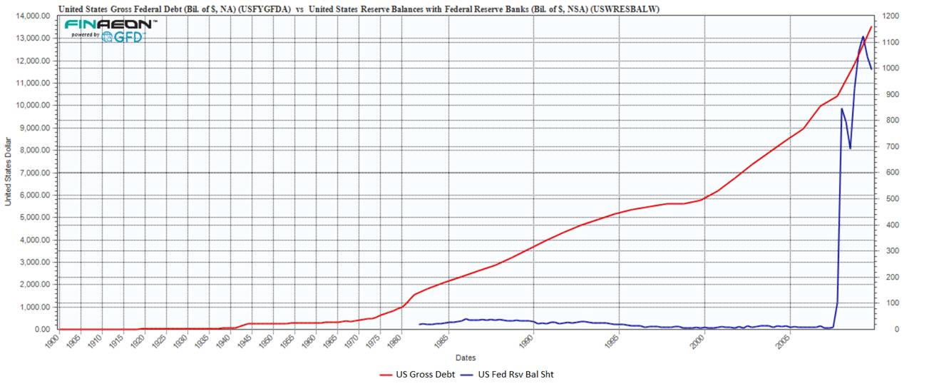
To put it all in a bit more perspective, I thought it would be interesting to take a look at the US Gross Federal Debt and the Federal Reserve’s balance sheet. There are 2 things that really jumped out to me.
First, to see the QE program in this light is absolutely frightening. The parabolic rise in the amount assets (or liabilities) that the FED now holds is truly amazing. And second, to think about how much debt was created from the mid 1980’s to 2008 and who was buying it. We certainly were not. For nearly 30 years, the FED’s balance sheet was a flat line and then it exploded in 2008 as the QE programs accelerated. At the same time, you can clearly see the Federal Debt trend line turn dramatically turn upward. We print we buy. To think that we printed and created this massive amount of debt is something to be concerned about for sure and should weigh clearly on the mind of investors.
So while in the first chart we speculated about the S&P 500, here I would have to speculate what is going to happen to the Federal Government when all of these programs end. What will happen to all of this debt and our obligations to pay for it when interest rates rise as we have seen over the past few months. With some calling for rates to close at over 3% by year’s end, I can hardly imagine how we will ever begin to pay for all of this printing and pumping. I can only assume by the Fed’s prior actions, that the next leg up for the S&P 500 will be when they announce that the taper has now been taken off the table. And with that, the ruse is still alive and the and the markets will soar to even higher levels.
Source:
Ralph M Dillon
www.globalfinancialdata.com


What's been said:
Discussions found on the web: