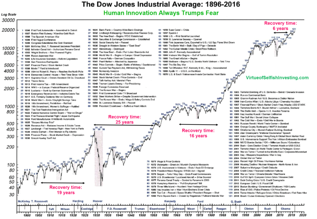
This graph of the Dow’s performance since 1896 that charts the index’s peaks and troughs, reflecting a variety of economic triumphs and tribulations. It intriguing to consider the short term reaction to various news events within the broader context: fear, market wobbles and occasional over-reaction.
“There is no get-rich-quick scheme. There is no such thing as a black box where you press a button and let it run indefinitely. Investing is more challenging than brain surgery.” -Chris Kacher, MoKa Investors
I find the graph + the annotations quite fascinating:
Human Innovation (eventually) Surpasses Short-term Fear
Click for ginormous grpahic

Source: Marketwatch
See also: Gradual Improvements Go Unnoticed
Update: James Macintosh points out that the chart neither includes Dividends nor is inflation adjusted (I like showing that as a second “compare and contrast” chart.
And, we should also note “New boom 1919, bust ’29” via the roaring twenties; that 19 year recovery section is therefore incorrect . . .

