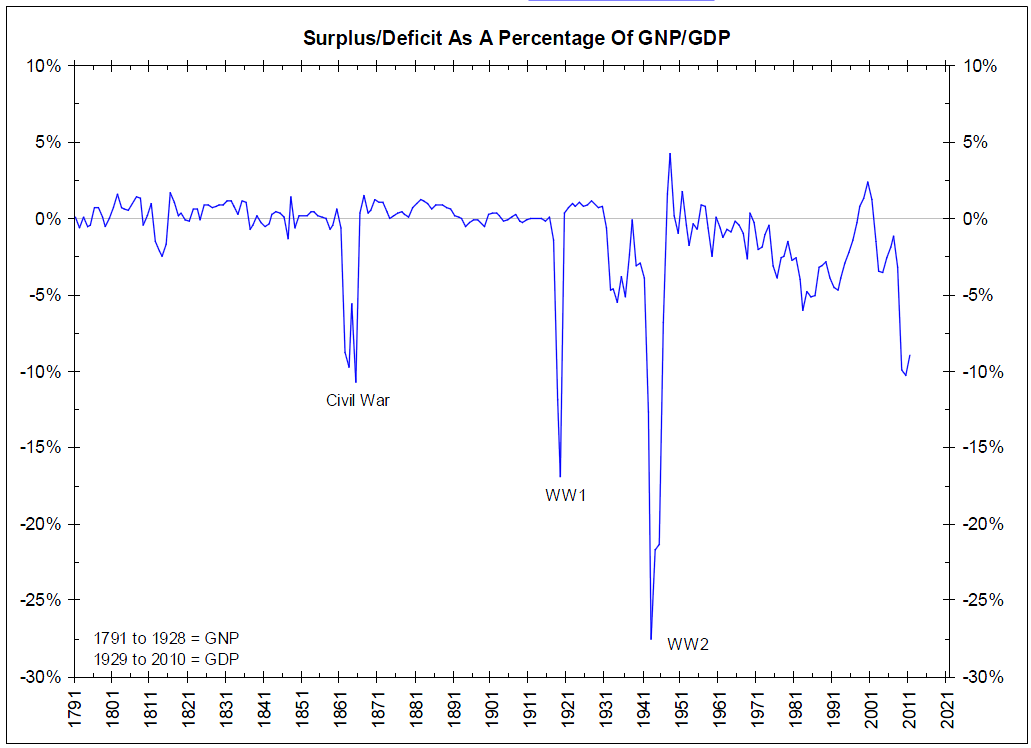
This chart below comes from the weekly slide deck (December 1, 2010) of Bianco Research (which is “must reading” around here).
I cannot recall ever seeing a chart that put the deficit into such crisp context. (The one variable I’d like to control for is Federal govt as a percentage of GDP).
>


What's been said:
Discussions found on the web: