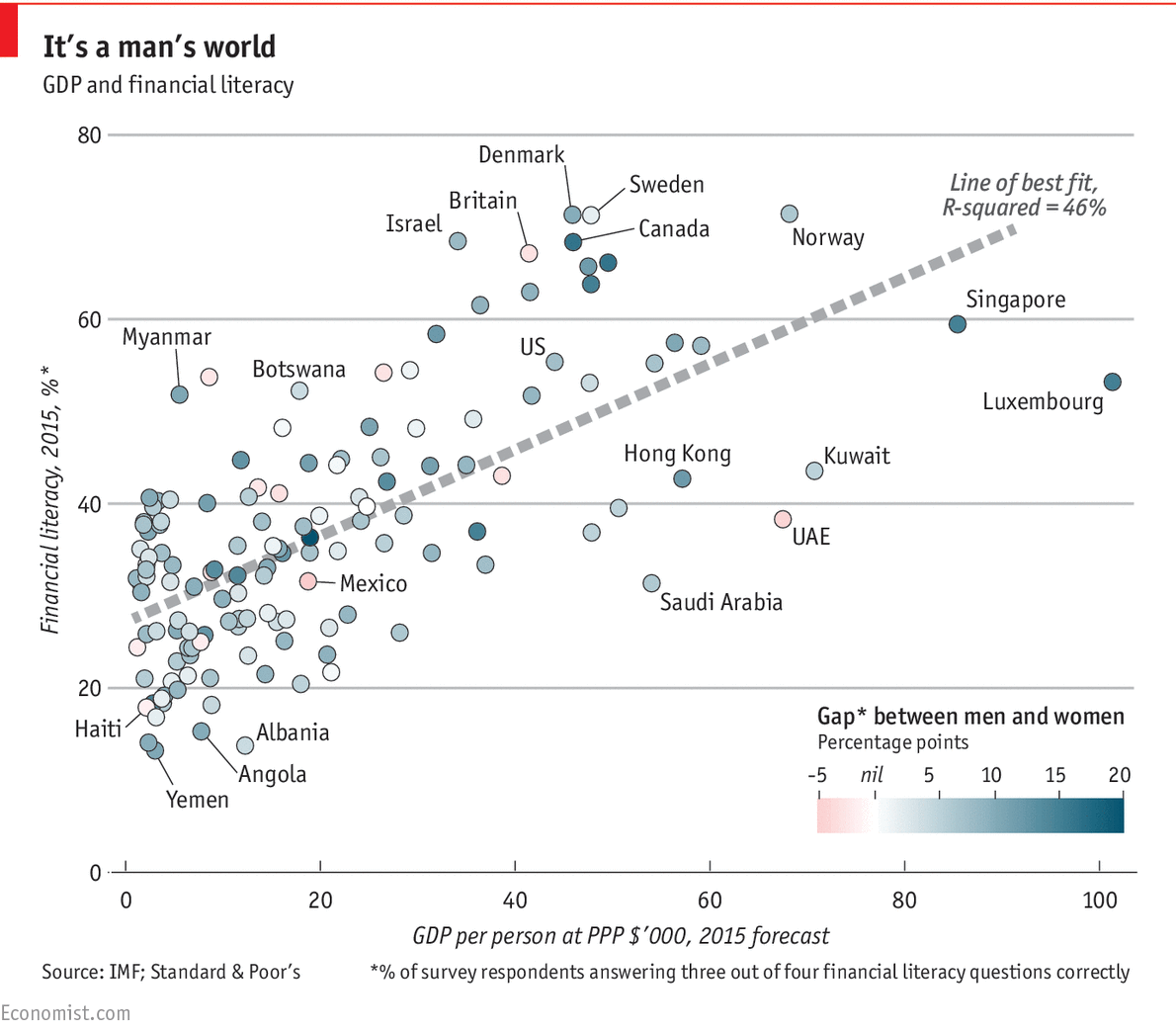
This chart and the accompanying discussion is amazing:
Financial knowledge seems to be gained only through pain and bad experiences. What is surprising to me is the huge gender gap — especially since studies show women tend to be better investors (less ego, more perception) then men.

Source: The Economist


Canadian women? I blame socialism!
Very cool chart!
I wonder though how the “best fit” correlation might change if the financial literacy data were plotted with respect to each nation’s median income (per person) rather than GDP-PPP per person. It occurs to me that since the financial literacy metric is applied to each nation’s entire population, the median income for individuals would be a better match with it than GDP-PPP per capita, potentially showing a much stronger correlation, given how income is naturally distributed (lognormally).
As is usually the case, the survey is vague in terms of where the interviews were held within each country.
Generalizations can be misleading. Even within the US, the dot colors could swing wildly by region.
You do have to be careful with incomplete information (now, isn’t that ironic).