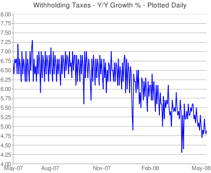
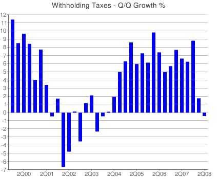
We have previously reviewed the Uncle Sam’s withholding tax data as a read into the overall health of the economy.
The most recent data point (March 13) shows W/H tax reaching a 23 month low. But we don’t like to rely on any single data point, especially one from a volatile series. Instead, look at the overall trend — is it moving up, or is it heading down?
At times, we have been critical of the perplexing read of this data by Charles Biderman of TrimTabs. Today, few words are necessary, as the charts speak for themselves.
>
Is this an economy in recovery, or one that is weakening?
charts courtesy of Matt Trivisonno
>
Sources:
Withholding Tax Haul Hits 23-Month Low
May 14th, 2008 at 3:32 pm
http://www.trivisonno.com/withholding-tax-haul-hits-23-month-low
DAILY TREASURY STATEMENT
Cash and debt operations of the United States Treasury
Tuesday, May 13, 2008
http://fms.treas.gov/webservices/show/?ciURL=/dts/08051300.pdf
Withholding Taxes Chart
http://www.trivisonno.com/investing/withholding-taxes-chart


there is no other explanation. the chart CLEARLY shows that we must be at the first stage of duplicating the late 2001 recession. It is so clear, and presented as to appear so obvious. Gosh, reading future economic trends is so easy!
Now all we need is another September 11th, then it will be a perfect correlation!
I was perplexed how this economy has added 90,000 service related jobs, but then I thought, hey, its April and its tax time. Could these added jobs be related to tax preparation?
I still don’t get these charts.
Chart 1 shows y/y growth of ‘only’ %4.75-5.00.
Chart 2 shows q/q growth of negative in the last quarter.
Question: why the disparity between the two charts?
To summarize:
Oil over 125, gas prices soaring…withholding taxes at 23 month low…foreclosures running rampant…yet stock market indicators are Euphoric…10 day total put/call just hit 86…market can only rise when volume is very low.
I can only draw one conclusion…new lows coming for stocks.
Eddie-
Lets assume 2007- Q1 = 1; Q2 = 1.1; Q3 = 1.21; Q4 = 1.33; 2008 – Q1 = 1.21
Then, q/q growth is negative (from 1.33 to 1.21), while y/y is positive (1 to 1.21)
Thus, the reason y/y is declining is due to the recent decline q/q.
-B
I love this chart…100 years of the Dow inflation adjusted shows it has been above trend by this much only twice before…1929 and 2000.
geocities.com/WallStreet/Exchange/9807/Charts/SP500/Dji200_0710.gif
I’ve been a bear since last summer, and holding on to my shorts the last few weeks hasn’t been easy. I’m THIS close to capitulating, but seeing those numbers helps me relax a little.
It reminds me of what I was told way back in Accounting 101: you can bullshit the balance sheet and income statement, but you can’t bullshit the cash flow. And the government’s cash flow is trending down, while all the other bullshitable signals are at worst indifferent…
Please!!PLease!! Barry..
Can’t you let us be in de Nile. There is NO inflation. Low unemployment! Peace in Iraq! Putin’s our friend. And Satan has turned into Santa Clause.
Markets up! Happy Days are here again, A La 1929.
Love,
H. Hoover
Steve Barry,
Great Graph.
Bernanke keeps saying we are going through a 1930’s-like moment.
But I believe maybe he has it all wrong, and your graph only serves to confirm that.
We are not in a 1930’s moment, but a 1920’s moment.
DownSouth
This time though, Americans have no savings and the demographics of Baby Boomers retiring will further constrain growth. BTW, the demograhics of China will now be a drag as well due to the one-child policy.
Liesman is saying that the video game grand Theft Auto is what propped up retail sales…$500 Million.
So our economy is being driven by a game that that lets you steal cars, get involved in a cop chase and punch passing pedestrians, all in between picking out a spiffy new shirt and bringing your date to the local bowling alley.
This country is really doomed.
Oh, if anyone comes up with a Westbury like reply, make sure to highlight it and move it to the top ! Can’t wait to see the explaination for this. Likely to hear.
5% isn’t bad
We are at the bottom now and moving up
Normal for a soft landing
It will be revised higher
and
So many opportunities for self employed riches that payroll is moving lower as folks are working for themselves.
Looks like a bottom to me. I’m calling a bottom.
Steve Barry,
When you talk about “Americans” I think you hit the nail on the head. My preferred term is “American families” but we are hammering at the same point.
It is obvious to anyone who is not completely deaf and blind that American families are in a deepening crisis. Stagnation of real incomes, loss of health and retirment benefits, lack of savings and soaring household debt are all all telltale signs.
And yet there exists this fiction on Wall Street that the economy is doing just fine. How can that be? How can those at the summit of the pyramid be safe when the substratum is giving way?
Another way to look at it is to consider the small units that make up a whole. This was one of the central ideas of Marcel Proust’s “A la rechereche”. Proust observed that “just as there are collections of animals, collections of humans…in the same way there are enormous organized accumulations of individuals which we call nations; their life only repeats on a larger scale the life of the cells which compose them.”
Proust’s observation begs the same question: How can the economic life of the nation be healthy when the individual family units that compose the nation are so sick?
I thought jobs info (which this would seem to fit into) were typically considered a lagging indicator? Wouldn’t the ticks lower indicate that the economy is probably fine, and now we’re waiting to wring out the employment issues?
It looks like the raw withholding tax growth is pretty closely tracking nominal GDP growth, which has fallen from the high five to the low four percent range over the past couple of years.
Meanwhile, CPI inflation has accelerated. So withholding tax growth has fallen even more sharply in real terms than this chart of nominal growth would indicate.
Let’s see … real wage growth slowing to a standstill, the housing ATM is flashing “no cash available.” What’s a Bubble Blower to do? Oh, right — goose stocks. It would take a couple of years (at best) to lift house prices by 10%. But in stocks, you can do it in six weeks. Plus, stock owners are a better-heeled crowd than the homeowner rabble. Better pray that trickle-down economics works! Hit me again, Dealer Ben!
What I find interesting about that chart, is that the author claims it to be nominal dollars.
I wonder what it would be with constant dollars?
is it possible to do the chart ex-government employees
that would remove the socialism loopback
then how about a chart ex-corporate government contracts (military & construction) to remove that loopback
I know they are all jobs and input to the economy … but in my mind they constantly need injections from somewhere
that somewhere is innovations in manufacturing, growing and digging … where man and the earth provide something for nearly nothing but an effort
The data in the second chart have to represent annualized Q/Q growth rates, not actual Q/Q growth. Or else 2004-2007 really would have been boom times!
ragging on myself:
the government employees & private contracts are such a huge portion of activity in our economy, you can’t discount them as a black hole or drain
paper pushers use chairs, computers and paper … contracts use all that and more
I guess the answer is “dole equally per input square mile”
I was shocked when I read this line from the post,
‘…The most recent data point (March 13) shows W/H tax reaching a 23 month low…’
The April Monthly Treasury Report indicates withholding was up 3.1% year over year. So, what gives?
I re-read the post and I think Barry just made a mistake. He meant to say the growth rate of withholding receipts hit a 23-month low. The charts were all about the growth rate of withholding receipts also, not the actual dollar amounts of receipts. Confusing? Yes. Also, it’s a stretch to suggest this means we are in recession.