I came up with a neat graphic design idea for the book, but I have no idea how to execute it well.
On the top of every page, there is room for a small graphic design. It is maybe 4 X 1 inches. Usually the book title goes there, but really, you probably already know the title of the book you are holding in your hands and reading.
I wanted to do something a bit funkier with that space.
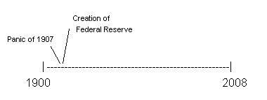
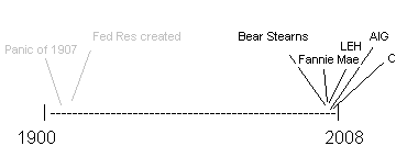
My concept was for a 100-150 year long time line. Something between a glyph and a ligature. Each chapter would highlight the events on the timeline that are in that chapter. As the book progress, the prior items are light gray, while each new bailout is bolded.
In the beginning chapters, it would look kinda like this:
And towards the end it would look like this (I omitted all the stuff in between for simplicity’s sake) :
It can be either all typeface or a series of graphics.
There are about 25 events that would have to squeeze into the timeline. If you flipped all the pages it would look like a flip book history of bailouts.
If any reader wants to take a stab at doing it (or can shed some light on how), you will earn my undying gratitude, a credit in the author’s acknowledgment, plus a signed copy of the book (ready to be resold on eBay).
Any ideas?


What's been said:
Discussions found on the web: