That’s the question Bob Cringely asks.
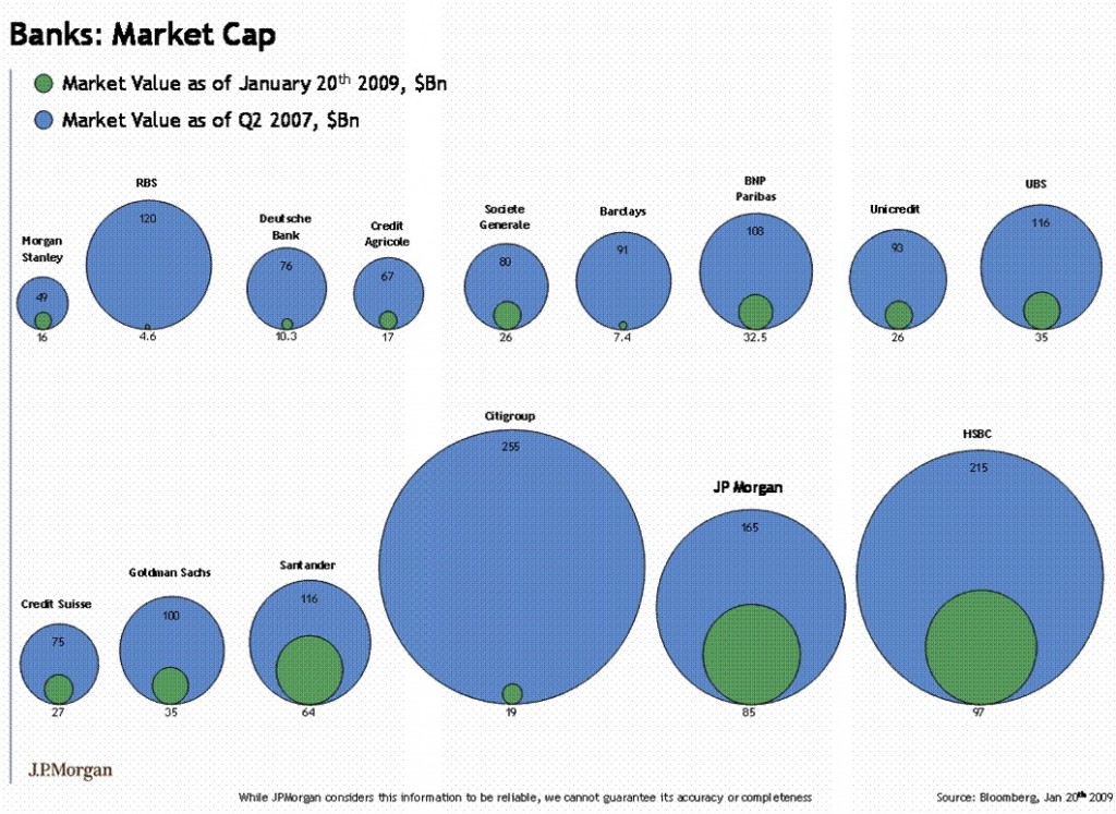
Bob points out what might be an embarrassing error in a chart (below) — on the Banks/Financials no less — prepared by a JP Morgan Analyst:
It’s a chart showing the deterioration of major bank market caps since 2007. Prepared by someone at JP Morgan based on data from Bloomberg, this chart flashed across Wall Street and the financial world a few days ago, filling thousands of e-mail in boxes. Putting a face on the current banking crisis it really brought home to many people on Wall Street the critical position the financial industry finds itself in.
Too bad the chart is wrong.
It’s a simple error, really. The bubbles are two-dimensional so they imply that the way to see change is by comparing AREAS of the bubbles. But if you look at the numbers themselves you can see that’s not the case.
Take CitiGroup, for example. The CITI market cap dropped from $255 billion to $19 billion — a difference of 13.4X. If we’re really comparing the areas of the bubbles, that means 13.4 of those tiny CitiGroup-of-today bubbles should precisely fill the big CitiGroup-of-the-good-old-days bubble. Only they won’t. As a matter of fact it would take about 13.4 times as many little bubbles to fill the big bubble as the chart preparer thought or 179.64 little bubbles. Pi r squared, remember? This is because the intended comparison wasn’t two-dimensional but one-dimensional — the chart maker was intending we compare the DIAMETERS of the bubbles, not their areas.
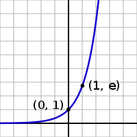 My first read of this is that comparing height (i.e., bars rather than circles) would be accurate. Circles won’t work due to the squaring (π R squared) , where as diameters do not bring in a factorial change. That’s what creates the exponential rather than arithmetic change in the circle’s area.
I don’t have the original data, and I am wondering if this might be a simple Excel charting error [Update: Excel gives you the option of selecting Area or Diameter when choosing the circle chart as an option. I suspect this was a simple spreadsheet graphing error — not a mathematics error — but its embarrassing nonetheless]
If anyone has either the Market cap data handy, or wants to pull the teeny data from the chart onto a spread sheet, please email it to me at thebigpicture-at-optonline.net. Alternatively, if you can design a more informative/accurate graphic, please send that along . . .
UPDATE: 2/15/09 5:52pm
Several corrected versions of the original chart (below) follow . . .
>
click for ginormous chart
>
Rene Corda suggested this as the the proper picture:
New & Improved Chart
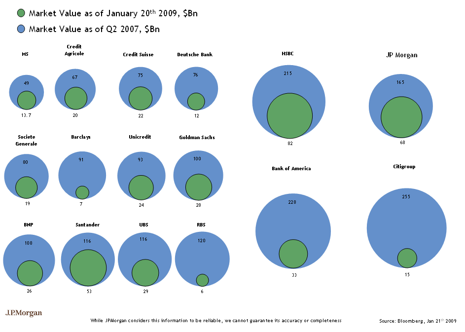
(looks like JPM fixed their own chart)
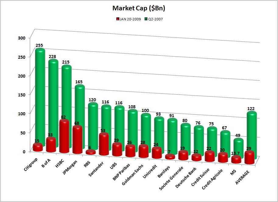
QQQ Trader send this chart along (with averages!)
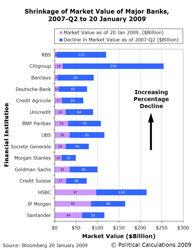
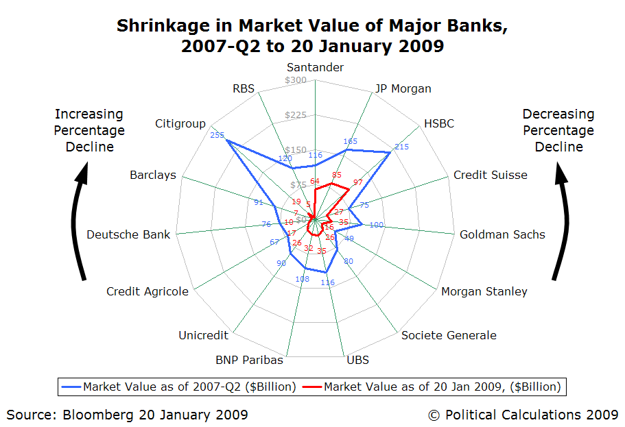
Ironman at Political Calculations gives us these two beauties:
Bar Chart:
Radar Plotting Chart:
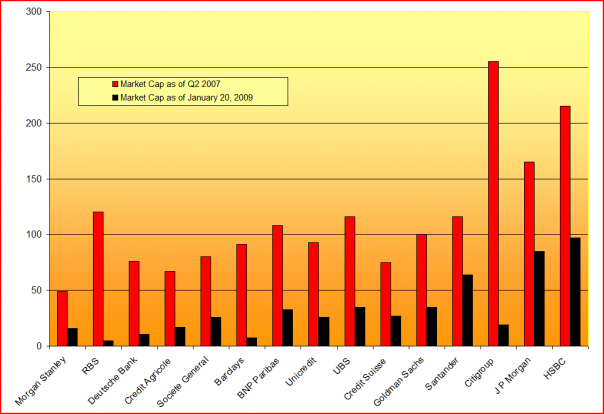
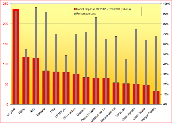
And Mark McHugh of Across the Street came up with these two beauties:
>
Source:
Wall Street Can’t Count
Robert X. Cringely
February 12th, 2009
http://www.cringely.com/2009/02/wall-street-cant-count/


What's been said:
Discussions found on the web: