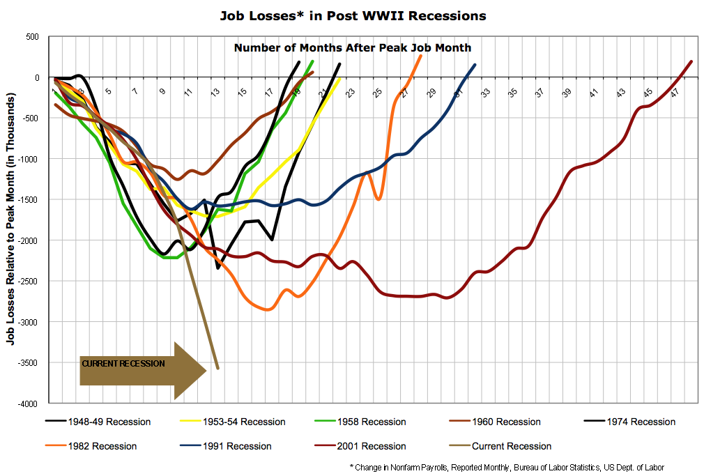
Over the weekend, we ran this chart comparing Job Losses this recession versus the prior two recessions. Today, we look at the same concept, only going back to ALL post WWII recessions
>
Amazing chart: Job Losses in Post WWII Recessions
Hat tip to Matt G. (via Swampland & the Speaker’s Office).
>
UPDATE: February 9, 2009 12:03 pm
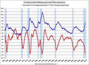
Have a look at this chart via Calculated Risk;
The Red line at bottom shows job losses as a percentage, not total numbers.


What's been said:
Discussions found on the web: