via NYT
>
Some charts are simply too beautiful to relegate to our digital media slum, and this one fits the bill.
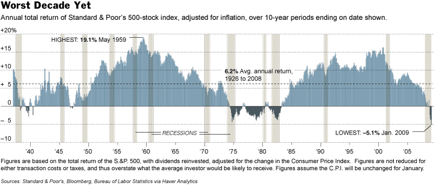
Its from Floyd Norris’ NYT column today, A 10-Year Stretch That’s Worse Than It Looks:
“IN the last 82 years — the history of the Standard & Poor’s 500 — the stock market has been through one Great Depression and numerous recessions. It has experienced bubbles and busts, bull markets and bear markets.
But it has never seen a 10-year stretch as bad as the one that ended last month.
Over the 10 years through January, an investor holding the stocks in the S.& P.’s 500-stock index, and reinvesting the dividends, would have lost about 5.1 percent a year after adjusting for inflation, as is shown in the accompanying chart.
Until now, the worst 10-year period, by that measure, was the period that ended September 1974, with a compound annual decline of 4.3 percent. . .
For the current period, the total return was negative, at minus 2.6 percent a year, even before factoring in inflation.
Note that the period ending in 1974 had a nominal return of 0.5%; the inflation adjusted return was -4.6%.
>
Source:
A 10-Year Stretch That’s Worse Than It Looks
FLOYD NORRIS
NYT, February 6, 2009
http://www.nytimes.com/2009/02/07/business/07charts.html


What's been said:
Discussions found on the web: