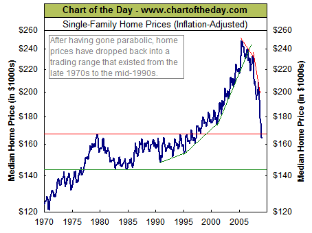
The Chart of the Day has an interesting look at median prices of single-family homes in the US on an inflation adjusted basis (below).
Where COTD goes off base is looking at a single factor — price — and ignoring all else.
That brings us to today’s chart which illustrates how housing prices have dropped 33% from the 2005 peak. In fact, a home buyer who bought the median priced single-family home at the 1979 peak has actually seen that home lose value (1.6% loss). Not an impressive performance considering that nearly three decades have passed.
Its a bit misleading to use a single factor — inflation – for the purpose of generating investment returns regarding housing.
Whenever we discuss home ownership, we must also recognize 1) Tax benefits of mortgage interest deduction; 2) Mortgage vs rent payments that you would have been making otherwise (with zero return); 3) non-monetary benefits of owning your own home.
I have been one of the biggest bears on housing for the past 4 years — but the chart below fails to tell the complete home ownership story from an investor’s perspective.
>


What's been said:
Discussions found on the web: