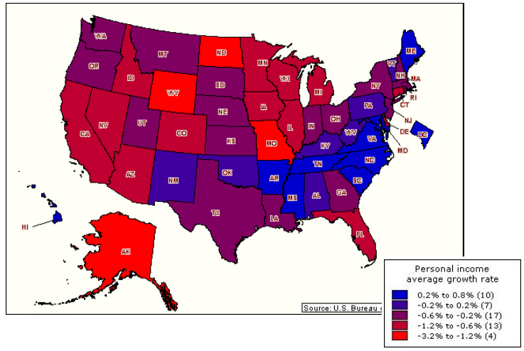
We can’t let a Friday go by without something Employment/Income related. Hence, this lovely BEA chart, showing changes in personal income by state:
The data for Q1 — yes, it is both old and lagging — is still stunning nonetheless: 74% of the states showed a drop in Personal Income.
>
Personal Income Changes, by State
via Bureau of Economic Analysis
UPDATE: June 22 2009 6:23am
David Rosenberg writes:
“As an aside, the U.S. Commerce Department also released state-by-state income data yesterday for 1Q and found that personal income deflated in 37 states. That is a very generous assessment since whatever income there was reflected government benefits like food stamps, unemployment insurance and welfare. Income derived from the private sector — remember that part of the economy? — actually contracted in all 50 states.
Whatever shoot that is, it definitely is not green.”
>
Source:
PERSONAL INCOME AND OUTLAYS
BEA, April 2009
http://www.bea.gov/newsreleases/national/pi/pinewsrelease.htm
Personal Income Drops in 37 States
David Wessel
Real Time Economics, June 18, 2009, 9:34 AM ET
http://blogs.wsj.com/economics/2009/06/18/personal-income-drops-in-37-states/


What's been said:
Discussions found on the web: