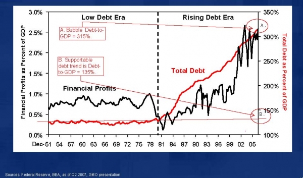
Last week, we looked at the Total Credit Market Debt to GDP ratio. Here’s another variation of the chart showing, looking at 2 differing periods –pre-1981 and post-1981.
Note that as debt rises, so too did financial firm profits.
Low Debt Era vs Rising Debt Era
GMO chart via New Observations


What's been said:
Discussions found on the web: