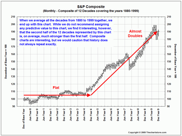
Via Ron Griess of The Chart Store, comes this chart showing what the amalgam of every year over the over the course of a decade looks like, when averaged over the past 12 decades:
>
>
I wonder if the Presidential Cycle impacts this in some major way . . . ?


What's been said:
Discussions found on the web: