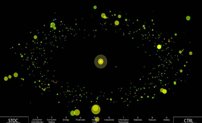
Today’s unusual market related project comes via Uniform Chaos: STOC Stock Ticker Orbital Comparison.
It is a data visualization of the S&P 500 from the NYSE programmed in Processing:
“Each circle in the visualization represents one of the stocks in the S&P, with characteristics of each visualizing different data points for each. There is a legend in the project that will explain the relationships between data and visuals, as well as a list of the controls for interactivity. In the very near future we will be posting a tutorial video as well as the podcast ACM recorded of my Siggraph presentation.
Below is a screen grab, and you can see video here.
>
>
Hat tip information aesthetics


What's been said:
Discussions found on the web: