Tomorrow is NFP day — and when those numbers come out, we won’t have much time to discuss much else.
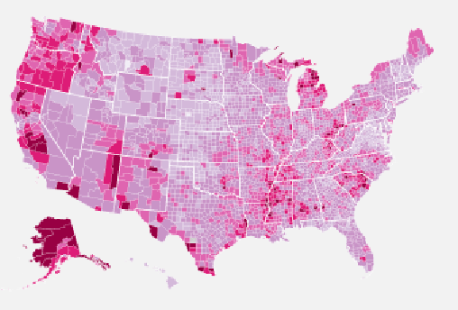
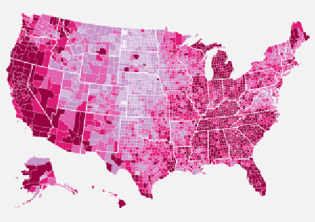
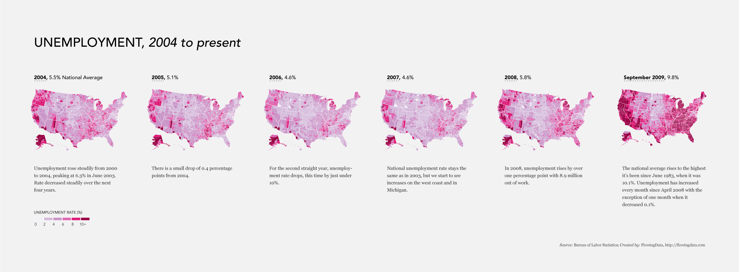
So while I am winging to Austin early this a.m., I wanted to share these interesting run of charts, via Flowing Data, showing relative unemployment in the US.
2004, 5.5% Unemployment (National Average)
2009, 9.8% Unemployment (National Average)
Here are all of the years in between:


What's been said:
Discussions found on the web: