Okay, chart fans: Here are some of the more informative, telling and fascinating charts tha the December 4 Non-Farm payroll helped to produce:
>
Total Non-Farm Payroll (Scale: Millions of Workers)
click for ginormous charts
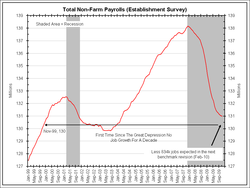
courtesy of Bianco Research
>
Comparing Job Changes During Recessions
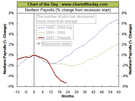
via Chart of the Day
>
Percent Job Losses in Post WWII Recessions (December 2009)
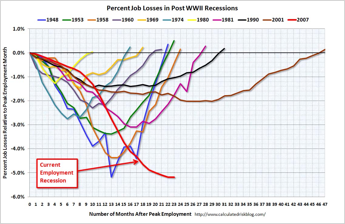
via Calculated Risk
>
Expect Big NFP Revisions
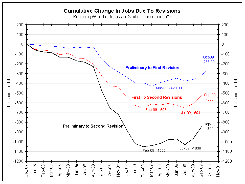
courtesy of Bianco Research
>
Click through for more charts
>
Comparing Long-Term Unemployment: 1999-2009

chart by RM courtesy of Ritholtz.com
>
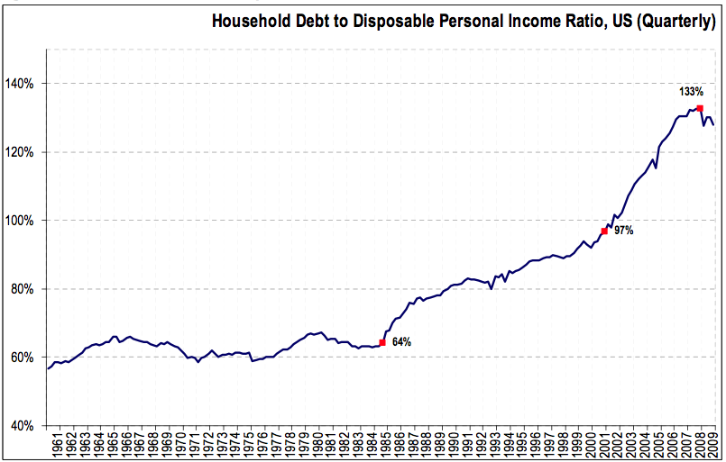
Household Debt to Disposable Personal Income Ratio
chart courtesy of Invesco/AIM
>
Labor Data November 2009
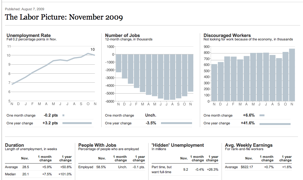
courtesy of NYT
>
US Unemployment Rate (1941-2009)
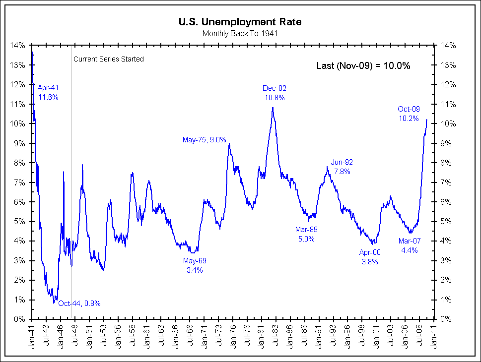
courtesy of Bianco Research
>
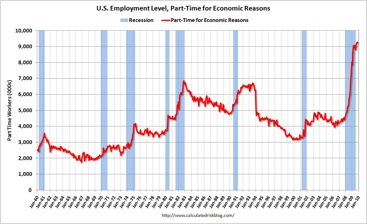
Under-Employment: Part Time for Economic Reasons
via Calculated Risk
>
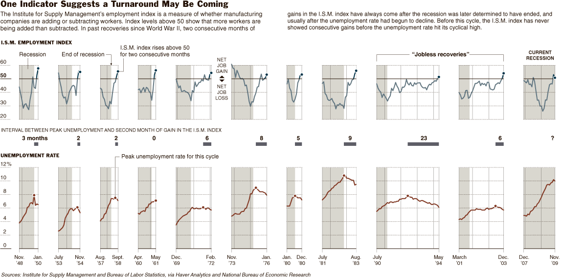
Signs of a Turnaround?
courtesy of NYT


What's been said:
Discussions found on the web: