A few new charts hit my inbox since yesterday’s NFP data was released. These put the current state of the job market into greater perspective. (Click on charts to enlarge)
>
Monthly Changes in Non Farm Payroll, 2004-09:
This is a simple chart, showing the gains or losses each month over the past 5 years:
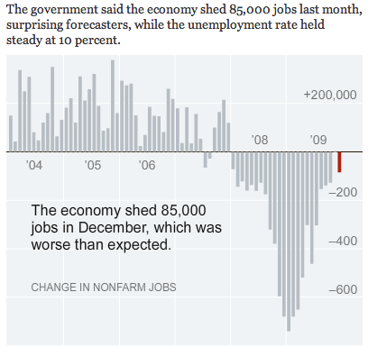
Chart courtesy of NYT
>
THE EMPLOYMENT RATE IS NOW AT 58.2% — LOWEST RATE SINCE AUGUST 1983
This to me is a devastating picture of the workforce in the US — at its lowest level in nearly 3 decades:
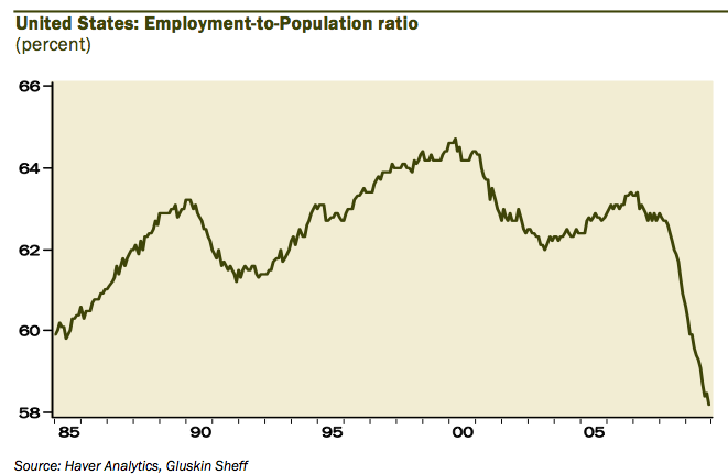
chart courtesy of Gluskin Sheff
>
Temp Help is Improving
Its not all glum — Temp help is improving, and tends to be a good early indicator of more hiring to come:
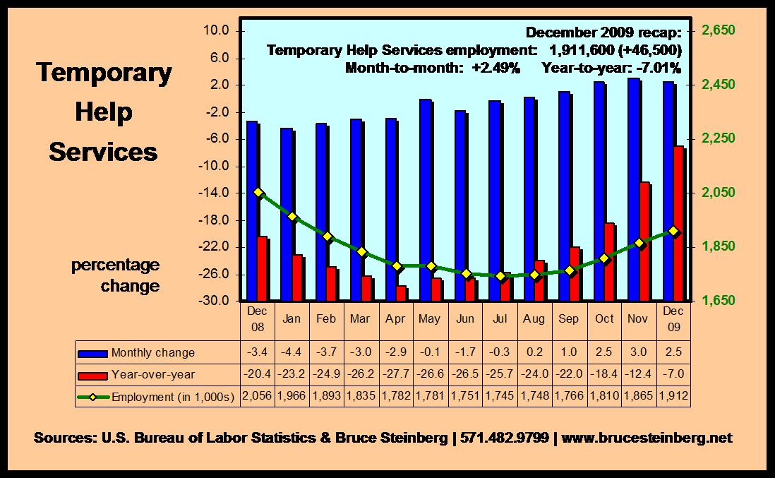
chart courtesy of Bruce Steinberg.net
>
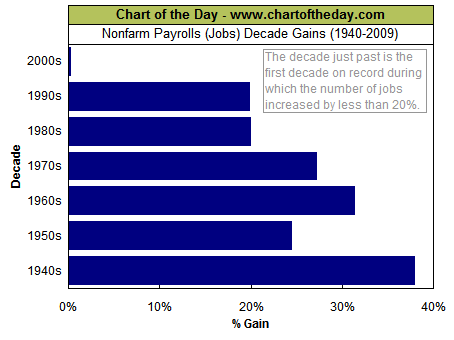
The 2000s were a bust: Nonfarm payrolls gains by decade (data to 1939).
Straight forward chart showing the lost decade of the 2000s in terms of US job creation:
>
THE PERCENT OF THOSE UNEMPLOYED 27 WEEKS AND OVER IS NOW AT 40%
Another ugly chart: The unemployed are not easily finding new jobs:
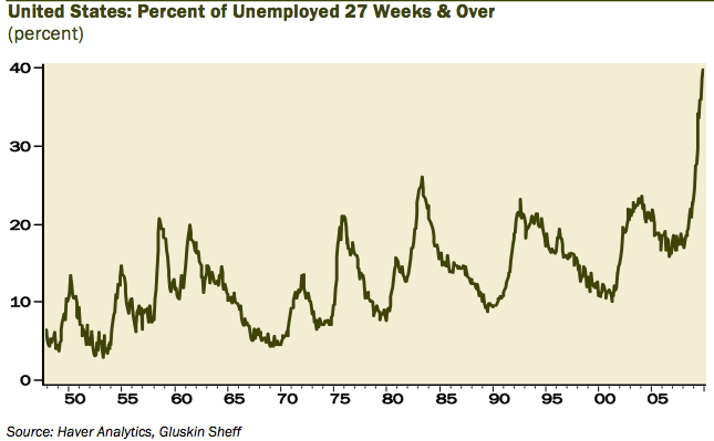
chart courtesy of Gluskin Sheff
>
Percent Job Losses in Post WWII Recessions
Here is what the 2007-2010 Recession looks like in terms of recovery of jobs lost:
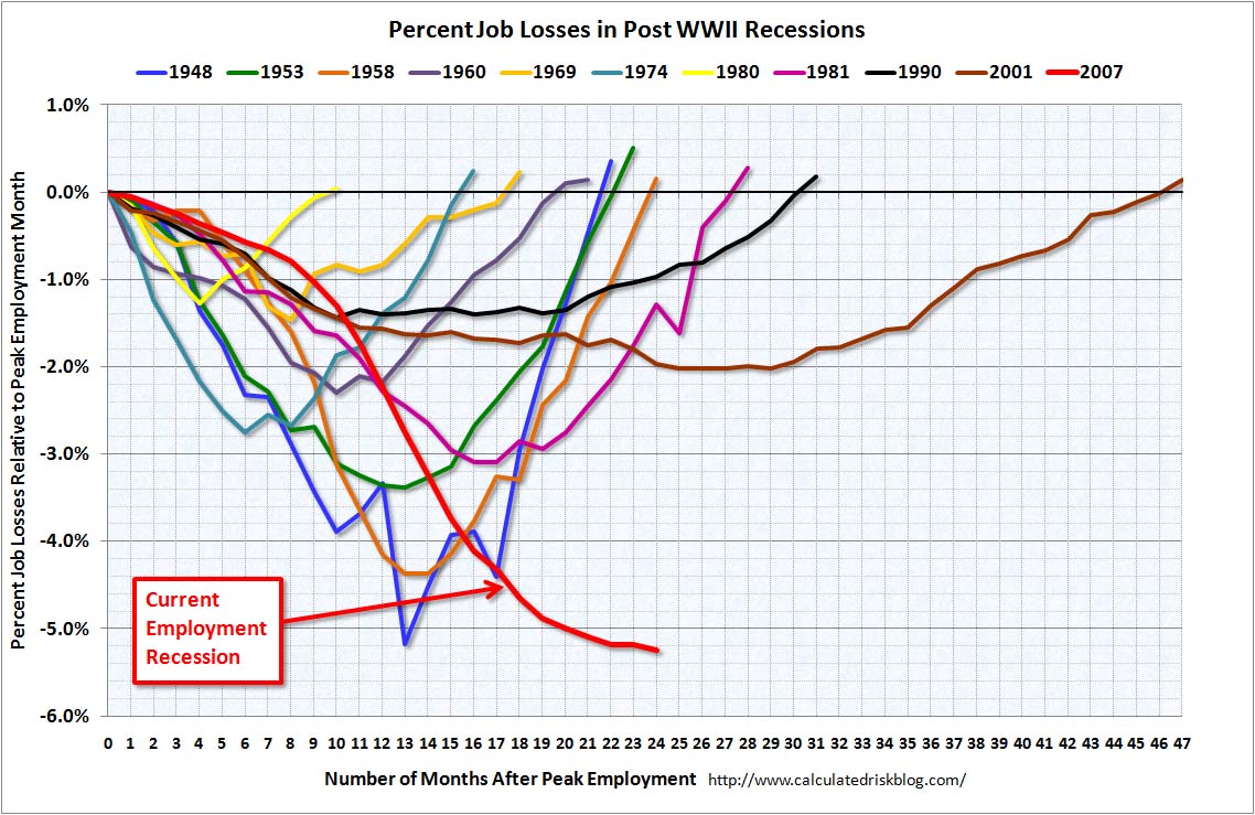
courtesy Calculated Risk


What's been said:
Discussions found on the web: