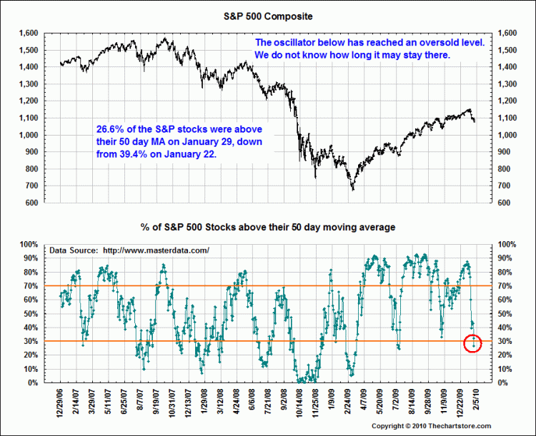
I was chatting with a friend over the weekend about various ways to look at overbought oversold conditions.
One of my favorite metrics is to look at a broad set of stocks relative to a moving average. I’ve previously mentioned the percentage of S&P500 stocks trading over their 200 day moving average.
Today, we look at the percentage of stocks on the NYSE trading over their 50 day. You will note that we have not quite reached the levels that the two prior modest corrections hit in June and September.
>
NYSE Stocks (%) Over 50 Day Moving Average
chart courtesy of Singer$Market
I have yet to figure out how to get the percentages to show on these charts — I need my Bloomberg for that . . .
>
A variation of this is S&P500. The caveat with that is it tends to skew the size mix larger:


What's been said:
Discussions found on the web: