
Here are 10 of the most informative charts I’ve seen regarding Friday’s NFP:
>
Click for bigger (and in some cases, ginormous) charts
No Job Gains for a Decade
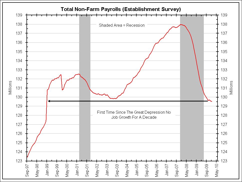
Bianco Research
~~~
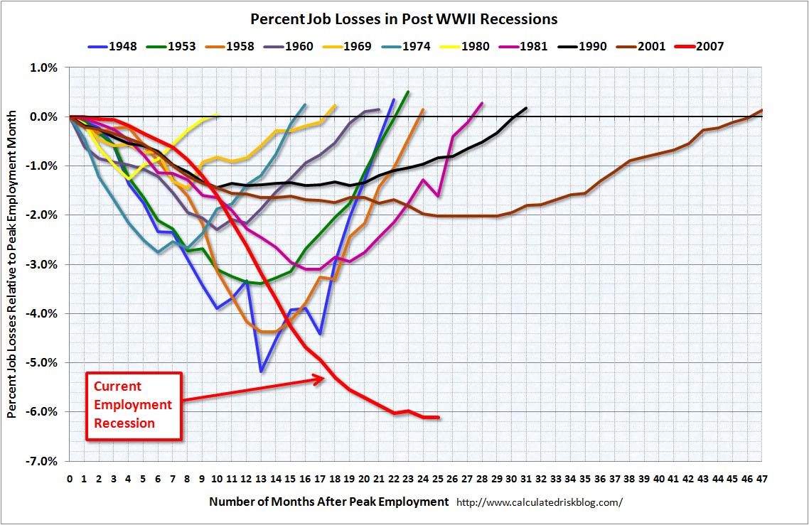
Percentage Job Loss form Recession Start

Chart of the Day
~~~
Cumulative Job Losses

Bianco Research
~~~
Unemployment Rate — Recessionary Peaks

The Chart Store
~~~
Job Losses 3 Month Moving Average
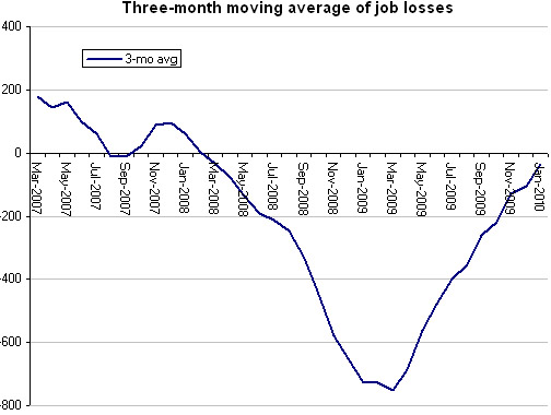
Economix
~~~
U3, U6 Unemployment Rates

Econompicdata
~~~
Temporary Help Situation

Bruce Steinberg
~~~
Using Unemployment Levels to Date Recessions
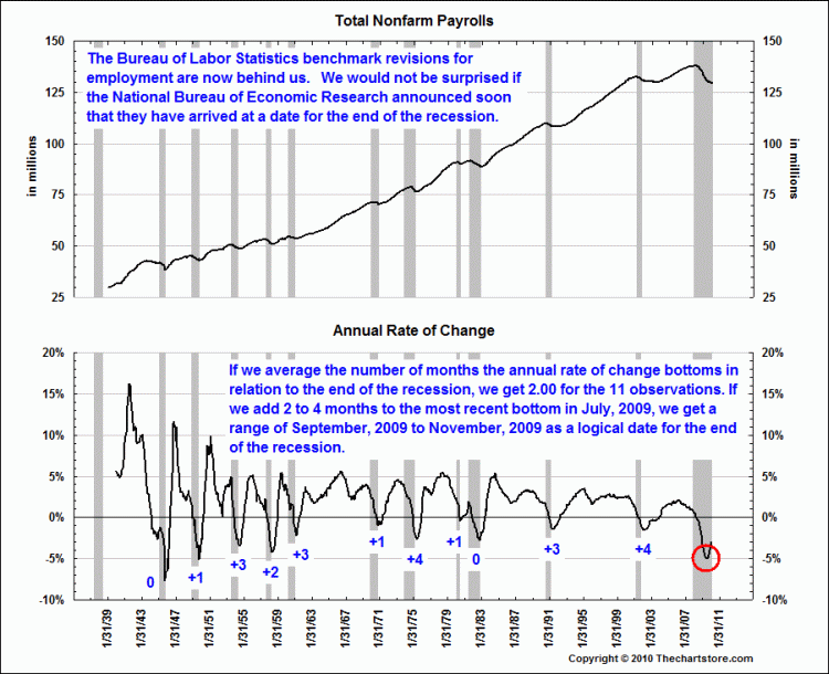
The Chart Store
~~~
Job Losses in Manufacturing
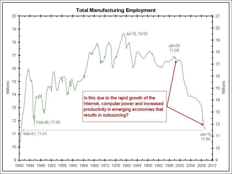
The Chart Store
~~~
Months to Recover Job Losses, Post WW2 Recessions

What's been said:
Discussions found on the web: