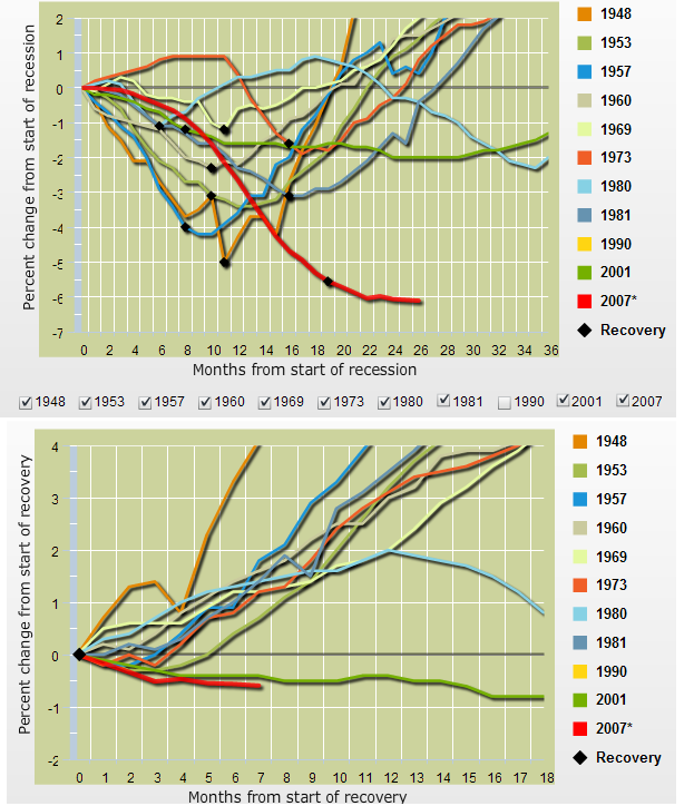
If you found the prior post on Employment too cheerful, well, have a gander at these charts, courtesy of The Federal Reserve Bank of Minneapolis by way of Jim Picerno’s Capital Spectator.
This is a fascinating look at where in each post war recession the recovery can be marked as beginning.
Have a look at the bottom chart; If the 2007-09 Recession end up being anything like the 2001 recession, we are still 4 or 5 years away from a full jobs recovery back to employment levels prior to the crash.
>


What's been said:
Discussions found on the web: