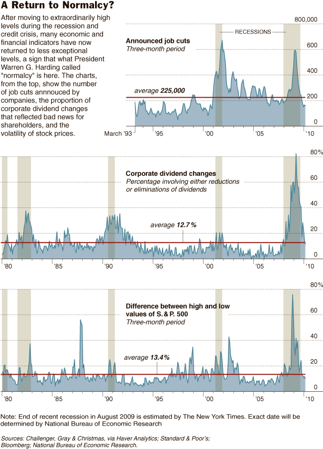
Floyd Norris looks at dividends, job cuts and asset prices, and assesses the return to normalcy:
“As the accompanying charts show, three disparate indicators — covering unemployment, corporate financial distress and stock market volatility — have gone from very high to a little below historical averages . . .”
Here’s the mandatory chart:
>
click for larger graphic

courtesy of NYT
>
Source:
After Jerky Swings, the Economy Begins to Look Nice and Boring
FLOYD NORRIS
NYT, March 5, 2010
http://www.nytimes.com/2010/03/06/business/economy/06charts.html


What's been said:
Discussions found on the web: