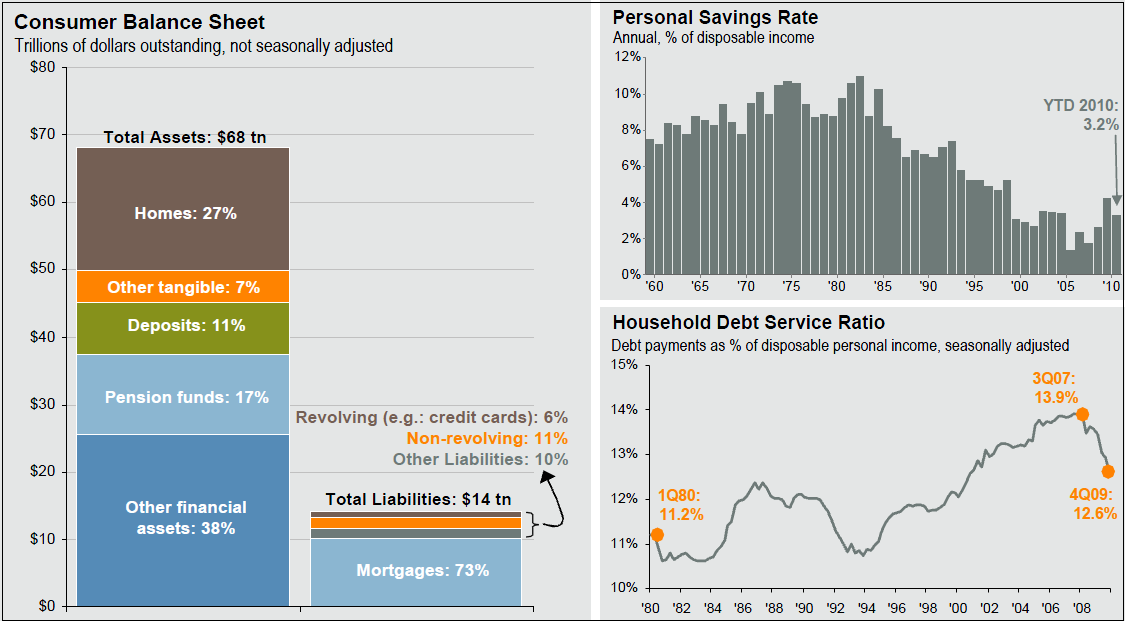
As per our prior discussion, let’s take a look at a nice set of charts showing the present state of Consumer Finances (all data thru Q1 2010):
Balance Sheet, Savings Rate, Debt Service Ratio
click for larger chart

Source: (Left chart) JPM, FRB, J.P. Morgan Asset Management. Data includes households and nonprofit organizations. (Right charts) BEA, FRB, J.P. Morgan Asset Management
* Personal savings rate is calculated as personal savings (after-tax income – personal outlays) divided by after-tax income and reflects data through February. Employer and employee contributions to retirement funds are included in after-tax income but not in personal outlays, and thus are implicitly included in personal savings. Savings rate data are as of Feb. 2010. All other data are as of 4Q09.


What's been said:
Discussions found on the web: