Last week, I showed JPM’s chart of why some investors perceive the market as cheap.
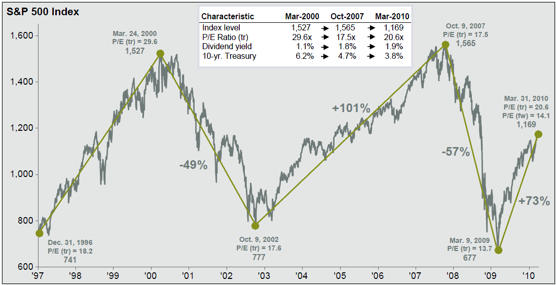
This second chart from the same source puts that into perspective, showing the valuation of the SPX at inflection points (all data thru Q1 2010). As you can see, the market was cheaper in March 2009 than March 2010.
Note what happened to trailing earnings as the market rallied over the 5 years from October 2002 to October 2007. Coming out of recession, companies grew into their forward earnings estimates.
There is no guarantee that the same thing will happen here. However, just as analysts tend to be too optimistic heading into a recession, they also tend to be too pessimistic coming out of recession.
>
S&P 500 Price, P/E, Div Yield
click for larger chart

Source: Standard & Poor’s, First Call, Compustat, FactSet, J.P. Morgan Asset Management.


What's been said:
Discussions found on the web: