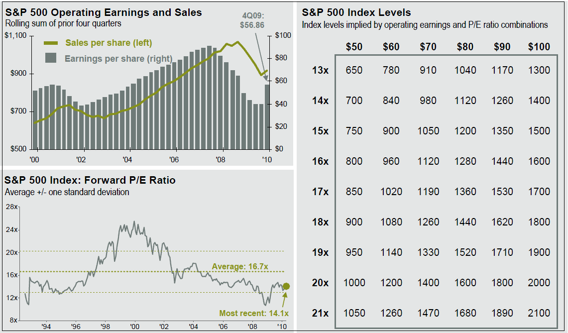
Regular readers know I am not a fan of Forward P/E ratios as they are too easily gamed — plus, they always seem to miss a major turn or reversal. They also tend to justify a bad investment posture, i.e., Perma-Bullish.
Regardless, if you are scratching your head wondering why anyone is buying into stocks at these levels, this chart explains why some investors perceive the market as cheap (all data thru Q1 2010):
S&P 500 Operating Earnings, Forward P/E Ratio
click for larger chart

Source: Source: Standard and Poor’s, Compustat, FactSet, J.P. Morgan Asset Management.


What's been said:
Discussions found on the web: