Dan M is a buyside analyst at a small macro hedge fund. He had the following observations regarding the significance of Google search data.
My personal views of contrary indicators are more nuanced, but I thought this was a very interesting approach to looking at Google trend. It is a decidedly different perspective, one worth thinking about.
Enjoy:
~~~
A popular meme these days has been to look at sentiment as a contrary indicator. I personally have used this argument many times, the theory being that when *everyone* feels a particular way, then the market has likely overpriced that in due to the “dumb money” pushing that meme too far as is always the case. The argument goes that the opposite is then prone to occur, because the dumb money always loses.
I had a fresh contrary look at this as reflected in the frequency of searches on Google via Google Trends (link), based on a few examples.
• Positive correlation w/ economic activity
• But does this work w/ price behavior?
• “stock market crash” was a leading indicator
• “Housing bubble” was a leading indicator
• “housing crash” was a leading indicator
• Relevance now – “double dip” implies double dip recession
• Relevance now – “hindenburg omen” implies … ?
• Relevance now – “bond bubble” implies Treasuries are rich?
>
Positive correlation w/ economic activity.
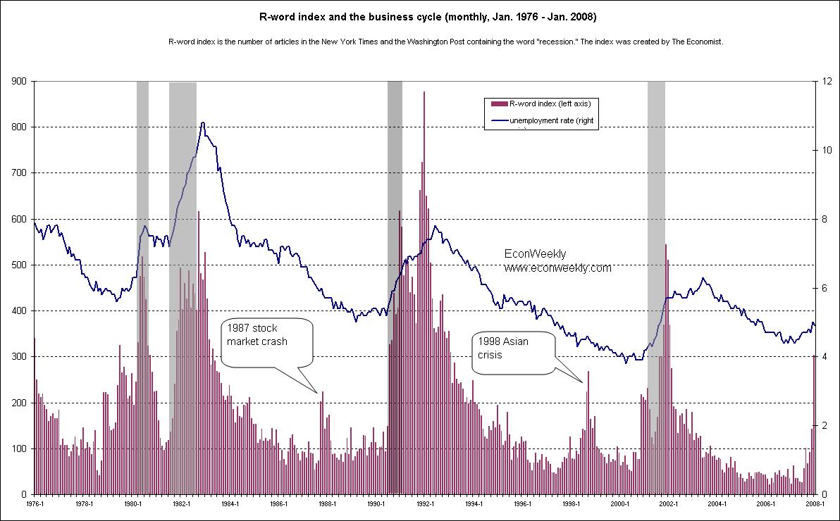
For one, there is the fact that economic activity actually has had a *positive* correlation to search term frequency. We have detailed at length this in the past – one example of this is search frequency for the term “recession”, which showed a clear initial peak in January 2008, a mere one month after the recession began (chart):
>
We have also shown charts that detail how this has also been the case as far back as 1980 onwards (chart:).
>
But does this work w/ price behavior?
One could say that economic activity is different from price behavior. Price behavior is based on the interaction of buyers and sellers, while economic activity is not zero sum at all.
“Stock market crash” was a leading indicator.
An interesting case study of this is a search for the term “market crash” or “stock market crash”, backed up to the very start of the market crash itself.
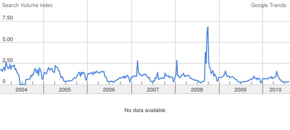
This is the graph of search frequency for “stock market crash”, which is largely similar to that for “market crash” (chart):
>
Note the clear peak in September 2008, with nothing really before that. The January 2008 spike was largely the same as what we saw in ~February 2007.
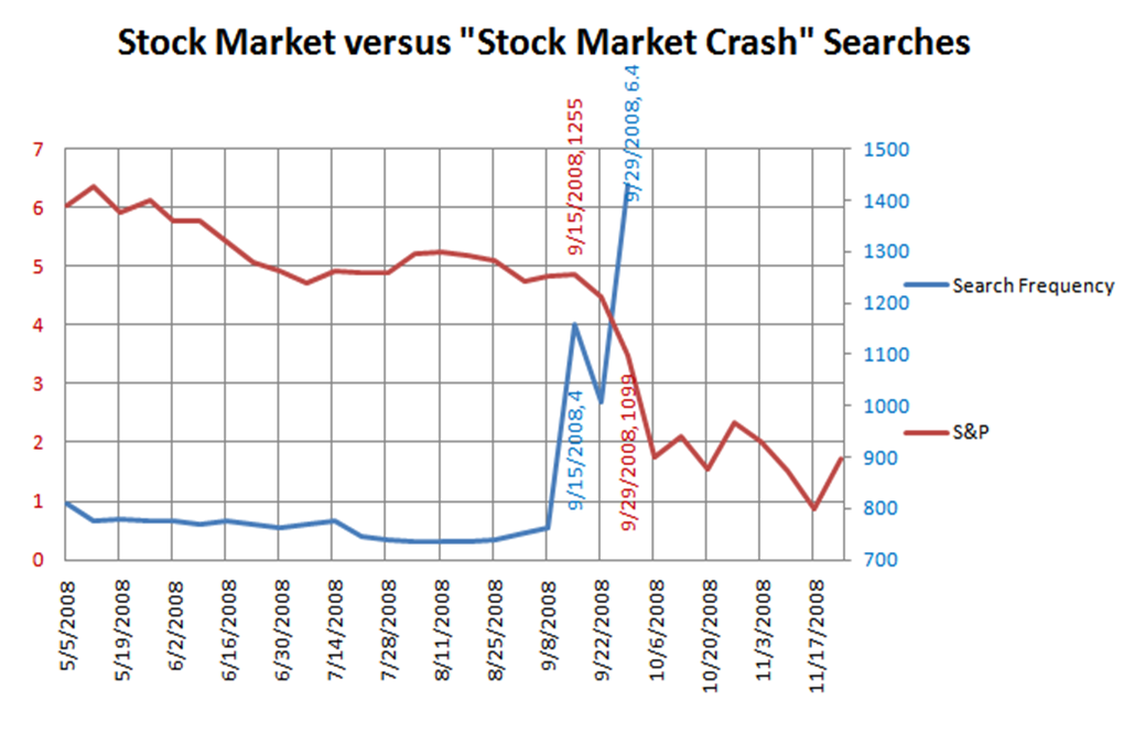
The simple response to this is “oh yeah, this simply peaked while the crash was happening”… but that might be a false assumption. Digging into the weekly data seems to paint a different picture, interestingly enough. We got a reading of 4 in the chart above on … September 15th 2008 (chart):
>
On September 14th, the S&P was at 1255. Heck, even when Search Terms went to 6.4, the S&P was still at a fairly rich 1099.
In other words, a spike to 4 actually *led* the crash, and was *not* a lagging indicator after the fact.
“Housing bubble” was a leading indicator.
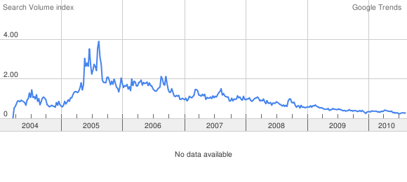
If this was the only example, that would be one thing. However we see the same pattern with search frequency for the term “housing bubble”. Search frequency for the term “housing bubble” spiked in May 2005 and peaked in August 2005 at 3.74 (chart):
>
>
This August 2005 peak is fairly remarkable, given that new home sales itself peaked in April 2005, with a retest of the highs in October 2005, before the secular decline:
>
So interest in the term “housing bubble” peaked 2 months before the effective high for housing activity, followed by a sharp decline in activity and a decline in home prices thereafter. So even in this market of buyers and sellers, we nevertheless saw the economic top coincide with search terms indicative of a market top.
As with the terms “recession” and “stock market crash”, it appears the threshold SVI is say, 3.7 and above, give or take, with a strong indicator being 4+.
“housing crash” was a leading indicator. Here is the same chart for the term “housing crash”:
>
Less applicable due to a lack of searching for this term early on, creating some herky jerky action in early 2006… but once again we did not cross 4, or even 3.7 for that matter, until August 20th 2006. By August 2006, new home sales were off 26% from the October 2005 peak, while Case Shiller home prices peaked in July 2006, just one month earlier (chart):
>
In other words, there is more than tangential evidence that strong search frequency is indicative not of the *contrary* move being likely, but of *self fulfilling prophecy*.
So this is all well and good, but where does it leave us now?
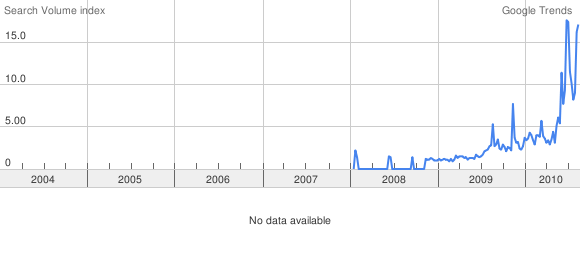
Relevance now – “double dip” implies double dip recession. Well, the term “double dip” has retested its highs lately. Once again, I believe this is indicative of growing fears over the economy. These fears should translate much in the same way they did for the term “recession” back in January 2008 (chart):
>
>
We have blown away readings of 4 and are presently north of 15. We registered this not once but twice. Anecdotal evidence abounds, as we have heard the likes of Greenspan and many, many others using that specific term “double dip” (link). Some say it can’t happen, while others say it’s possible (link) or likely (link), while still others say we’re already in it (myself, Mish), but the common denominator is that people are talking about it. The term “double dip” appears to have entered the collective psyche much the same way “recession” did back in 2008.
I will post the caveat, though, that we registered north of 5 around July 2009 and again in September/October 2009. We are well above that now, but back then, someone would have been suckered by a false positive relative to the data points above.
Relevance now – “hindenburg omen” implies … ?
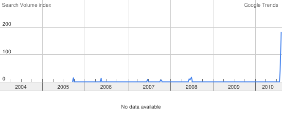
Interest in the term “hindenburg omen” has been amazingly strong as well (chart):
>
These readings are a bit unreal, having registered a whopping 172 on August 15th 2010. Note that we registered a confirmed Hindenburg in June 2008 – you see that blip of activity when that happened?
To put a reading of 172 in context, consider that “BP spill” registered no higher than 57 on May 30th 2010, at the very peak of searches for this term (Google). Keep in mind that these charts are showing *relative* search frequency – how much something is being searched for relative to its own past, not relative to anything else. One would have thought it’d be tough to go much higher than “BP spill”‘s reading at the height of the concern over what has become the 2nd biggest oil spill in the history of the world, but “hindenburg omen” did.
I had been saying that such interest in a statistical indicator of not-so-good relevance was indicative of a reversal higher being possible or even likely, before a shakeout. Money manager Barry Ritholtz seems to agree, calling it an example of “recession porn” (Ritholtz). Now I am not so sure, given the data shown above.
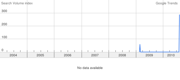
Relevance now – “bond bubble” implies Treasuries are rich? I did find one term that beat out even “hindenburg omen”. Yep… here is the chart for the term “bond bubble” (chart):
>
After nothing but insignificant readings, we hit a whopping 288 on August 15th 2010. All readings had been statistically insignificant until now, the Google data would have us believe (I am sensing that there are some possibly serious issues with their service though which could render much of this analysis less useful (ref1, ref2)).
Very interesting seeing real live quantification of herd behavior and its relation to markets and economic activity. Something tells me we’ll be seeing more of this going forward. Maybe at some point we will actually learn something.




What's been said:
Discussions found on the web: