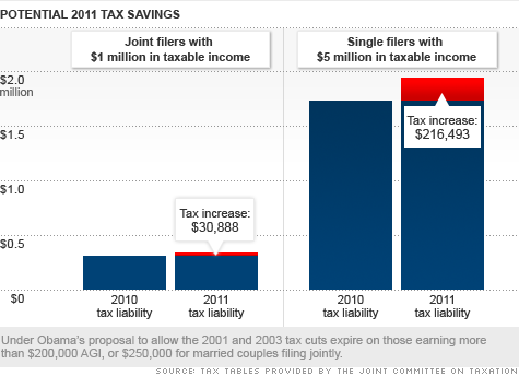
This chart is pretty stark in terms of who gets hit the hardest in the expiration of the Bush Tax cuts.
But this comparisons isn’t all that informative — how many of each of these taxpayers are there? What is the total amount of tax dollars collected in each grouping? Each bracket? How is this apportioned across the entire tax base? How does this compare relative to all of the tax cuts received since 2001-03?
The article adds a little color noting the following changes:
-If you make $382,650 you’ll owe an extra $4,095 in income tax.
-Single filers with $500,000 in taxable income would owe Uncle Sam an additional $9,492 from this year’s tax bill.
-Joint filers with taxable income of $700,000 would owe an extra $17,088
-$1 million dollars in taxable income = $32,493 more
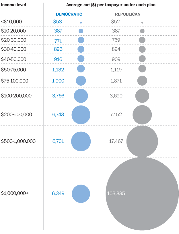
 I found the Washington Post chart (mentioned here) somewhat more informative than the chart above in terms of comparing the GOP and Democratic plans side by side in terms of brackets — but just as lacking terms of distribution of taxes across the entire taxpaying public . . .
>
Previously:
A Closer Look at the Bush Tax Cuts (August 13th, 2010)
Source:
Higher taxes for the rich: What they’ll pay
Blake Ellis,
CNN, August 18, 2010
http://money.cnn.com/2010/08/18/pf/taxes/bush_tax_cuts_rich/index.htm


What's been said:
Discussions found on the web: