I’ve been meaning to get to this chart for some time, so I am glad Good reminded me to:
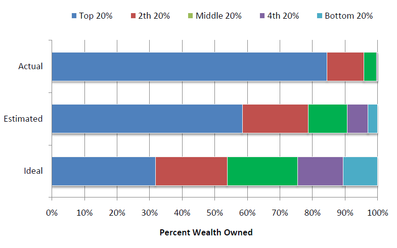
The actual United States wealth distribution plotted against the estimated and ideal distributions across all respondents.
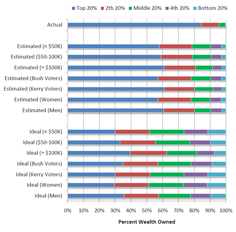
The actual United States wealth distribution plotted against the estimated and ideal distributions of respondents of different income levels, political affiliations, and genders.
This raises two questions in my mind:
Why are wealth estimates so wildly wrong?
What does this mean over the long haul in terms of balanced budgets, social security, national health care, etc.
I don’t know what the answers are — but i suspect the discussion can be intriguing.
Have at it. . .
>
Source:
Americans Are Horribly Misinformed About Who Has Money
Andrew Price
Good, September 28, 2010
http://www.good.is/post/americans-are-horribly-misinformed-about-who-has-money/
Building a Better America – One Wealth Quintile at a Time
Michael I. Norton,Harvard Business School
Dan Ariely, Duke University
Forthcoming in Perspectives on Psychological Science
http://www.people.hbs.edu/mnorton/norton%20ariely%20in%20press.pdf


What's been said:
Discussions found on the web: