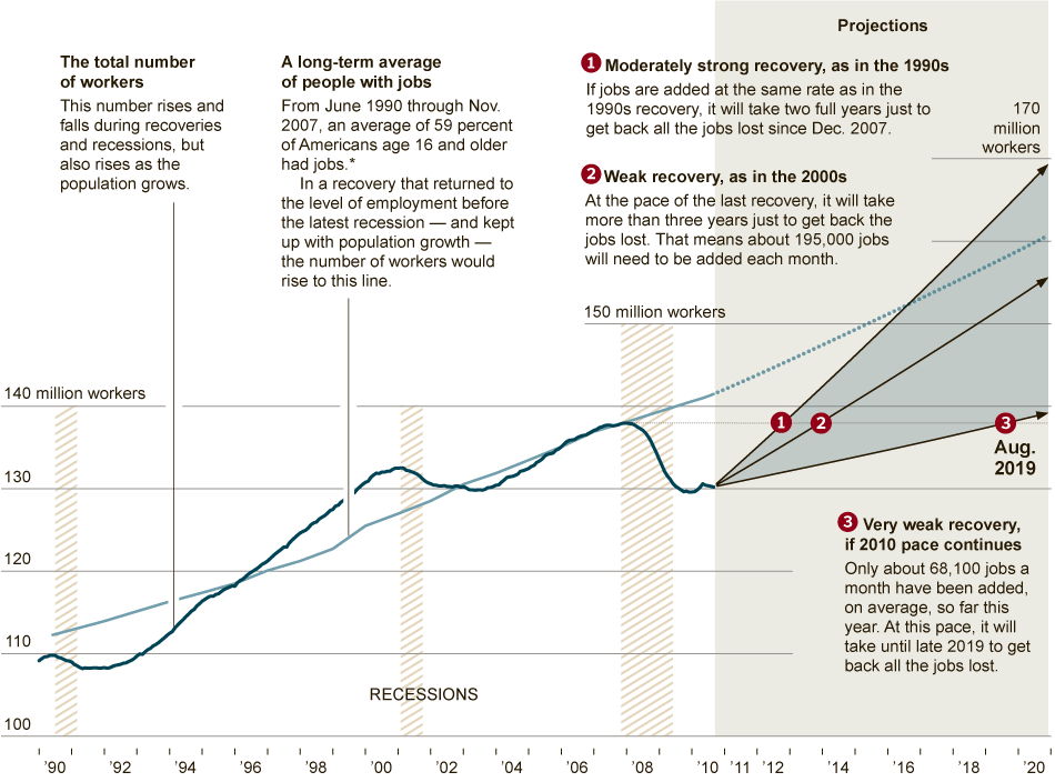
Interesting graphic from an otherwise mostly anecdotal NYT article discussing poor prospects for job recovery.
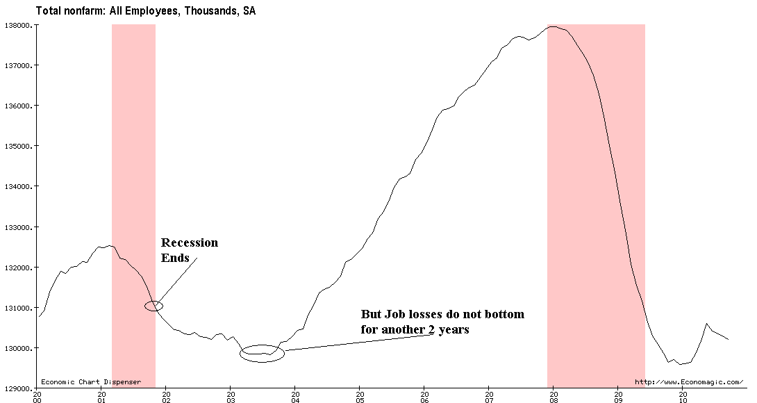
It made me think of this chart from when the NBER declared the end of the 2007-09 recession:
>
click for gionormous chart

Chart courtesy of Economagic
>
Here’s the NYT:
>
Source:
Across the U.S., Long Recovery Looks Like Recession
MICHAEL POWELL and MOTOKO RICH
NYT, October 12, 2010
http://www.nytimes.com/2010/10/13/business/economy/13econ.html


What's been said:
Discussions found on the web: