If you closed your eyes in January and opened them today, stocks have barely performed. But the swings have been enormous.
Markets of barely positive on the year, despite all the bad news — Greek scare, Euro crisis, Flash Crash, China slowdown, U.S. double dip, Treasury yields at all time lows, on top of the 2009 run up that left markets overbought.
Despite the ugly U.S. newsflow, US markets have actually been resilient this year. There have been multiple opportunities to rollover, or even crash, and somehow, we have managed to avoid that fate so far (Cue conspiracy wingnut rant). Perhaps this means equities have more strength than people think.
Let’s have a look at some of the present and historical data.
The first chart shows the swings the market has taken this year: Down 7%, up 14%, -15%, +10%, -6%, +9%. So much for Buy & Hold: This is a nimble trader’s market:
>
2010 Market Swings

Chart courtesy of Michael A. Gayed, Pension Partners
~~~
Next up, let’s look at some history: The Stock Trader’s Almanac shows us what September trading (since 1950) has looked like, along with the subsequent Q4 performance. Yes, its a sweet track record — 1973 and 2007 are the only real nasty marks — but I must remind everyone that correlation does not equal causation. (50 years of data is not sufficient to say this is not a random outcome).
The Alamanc notes:
“In nominal terms, Sept will be the 2nd best on record for the S&P 500, a great run of almost 10%. Let’s look at the gain in another context. As is done with economic data to take out the influence of inflation, a REAL calculation is done to deflate the NOMINAL reading in order to take out the noise of higher prices vs volume. Using the CRB index as a market inflation gauge for Sept, the S&P 500 in REAL terms only rose modestly as the CRB index is up 8.7% month to date. This highlights the allure of inflation and higher asset prices from a policy perspective as it creates an image of prosperity but with a much more unstable underpinning.”
Here is the Alamanac’s table of historical September versus Q4 runs:
~~~
| S&P | Sept | Q4 |
| 1954 | 8.3% | 11.4% |
| 1998 | 6.2% | 20.9% |
| 1950 | 5.6% | 4.9% |
| 1996 | 5.4% | 7.8% |
| 1997 | 5.3% | 2.4% |
| 1958 | 4.8% | 10.3% |
| 1973 | 4.0% | – 10.0% |
| 1988 | 4.0% | 2.1% |
| 1995 | 4.0% | 5.4% |
| 1968 | 3.9% | 1.2% |
| 2007 | 3.6% | – 3.8% |
| 2009 | 3.6% | 5.5% |
| 1967 | 3.3% | – 0.2% |
| 1970 | 3.3% | 9.4% |
| 1965 | 3.2% | 2.7% |
| 1964 | 2.9% | 0.7% |
| 1980 | 2.5% | 8.2% |
| 2006 | 2.5% | 6.2% |
| 1976 | 2.3% | 2.1% |
| 1955 | 1.1% | 4.1% |
| 1983 | 1.0% | – 0.7% |
| 1992 | 0.9% | 4.3% |
| 2004 | 0.9% | 8.7% |
| 1982 | 0.8% | 16.8% |
| 2005 | 0.7% | 1.6% |
| 1953 | 0.1% | 6.3% |
~~~
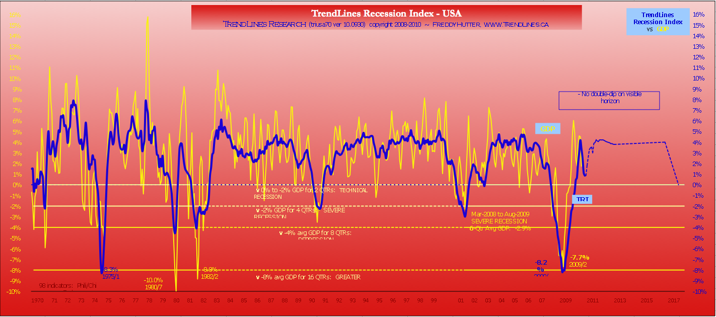
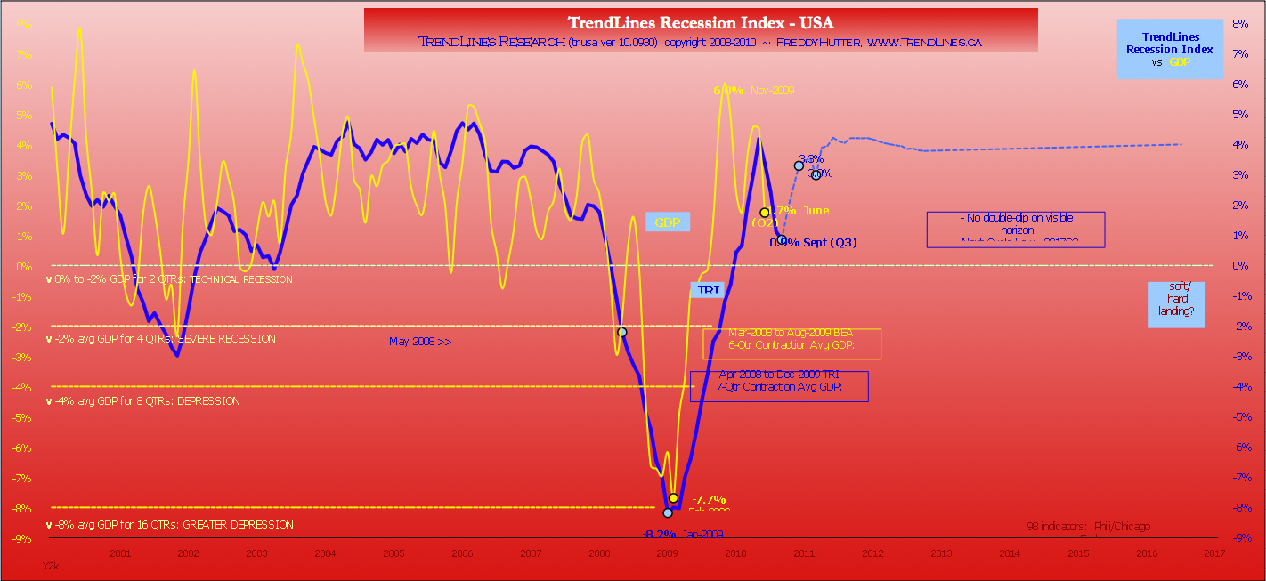
Last, let’s look at a set of economic projections that forecast future economic performance by combining historical patterns with recent data, from Trendlines Research.
40 Year Economic History
10 Year Chart with Projections
Trendline Research’s commentary:
“BEA’s downward revision of GDP figures in July (as much as 1.5% for some quarters over the last three years) brings GDP in line with our Index on the nearby chart. The corrected divergence is not unprecedented. On the way down, we were similarly distressed at the original 2008Q3 number of -0.5% while our Index was inferring -3%. We were overcome with relief upon BEA’s eventual downward revision -2.7%! Shortly thereafter, 2008Q4 was announced at -3.8% compared to our Meter Index inferred -9.8%. BEA has since downgraded that quarter to -6.8%! Some downward revisions are less probable. The 40-yr chart is instructive in its revelation that in each post-Recession Recovery, GDP far outpaces our Index for the first three quarters – probably reflecting the artificial nature of Keynesian Fiscal Policy.”


What's been said:
Discussions found on the web: