Invictus here.
Either because it was mildly political in nature or because it referred to government data, my recent critique of Sarah Palin’s foray into economics — specifically grocery inflation — garnered a fair amount of commentary. Putting the politics aside, I thought it might be instructive to take a closer look at how the BLS crunches the numbers that many claim are worthless. So, herewith a look behind the curtain at how the 12-month gain in Food at Home settled out at +1.4 percent. [NOTE: This may make some readers drowsy. Do not read on a handheld device while driving.]
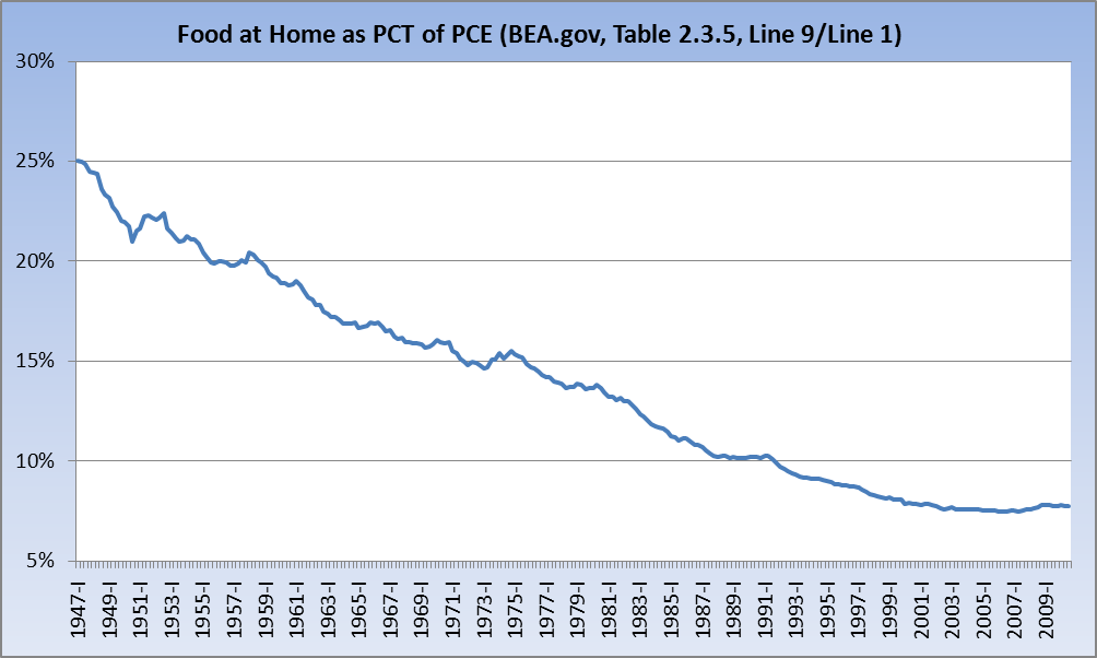
First, though, a look at what Food at Home — or Food and beverages purchased for off-premises consumption — represents as a percent of Personal Consumption Expenditures (about 7.8%):
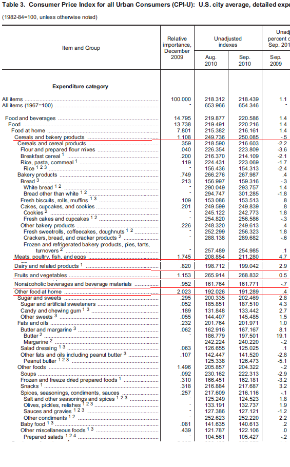
With that in mind, let’s look at the most recent report from BLS on CPI (Table 3, Page 10). For all who have shared their personal anecdotal evidence, please keep in mind that in addition to providing “U.S. City Average” data (which is what’s below), BLS breaks down by region and also by Metropolitan Statistical Area (MSA). So, while the numbers here may seem off to you, they might seem more on target if we were to filter down to your region, MSA, or city. I would expect the numbers for my locale to deviate significantly from the U.S. City Average (actual prices are referenced a bit further down).
There are six super categories, which I’ve underlined. In the interest of saving innocent pixels, I’ve cut many of the sub-categories. I left “Other food at home” because I thought it was important to look in the catch-all bucket; it’s included in its entirety (as is the Cereals category).

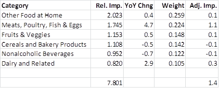
The first column above shows us what percent of total PCE is represented by the line item, hence 7.801 for Food at Home. Within Food at Home, below is a table that breaks down the six super categories within and details their influence in arriving at the overall 1.4% year-over-year gain (sorted by Relative Importance):
So, “Other Food at Home,” at 2.023, is 25.9% of 7.801, and at a +0.4% YoY change contributes +0.1% (0.4 * 0.259 = 0.1036). Clearly Meats, Poultry, Fish & Eggs comprised almost the entire year-over-year gain (1.745/7.801 = 0.224; 0.224 * 0.047 = +1.1), with Dairy & Related coming in a distant second, adding 0.3.
For those who would like to see the actual prices used by BLS in their calculations, please look in this PDF at Table P4, Page 107. It is in this table that BLS cites the prices it is using for the average U.S. city and for each of the country’s four regions. It is from this table that we can really do — pun intended — an apples-to-apples (~$1.30/lb. for Red Delicious) comparison. Sample below:
I’m sure everyone’s mileage varies here. And I do appreciate the fact that there are many anecdotal stories out there that differ from these numbers. But again, I would make two points:
- No data set is perfect
- You may find a better correlation to your personal “truth” if you drilled down to your region or MSA; the differences can be significant.
Now, if I had to guess, I’d speculate that with wheat having gone parabolic, we’ll soon see a visible spike in Cereals & Bakery Products.
CPI 101 is adjourned. Hope this is somewhat informative.
ADDING: Many questions about methodology are answered here and here (pdf). Of course, if your brain is broken you’re disinclined to believe the government’s answers, don’t bother clicking through.


What's been said:
Discussions found on the web: