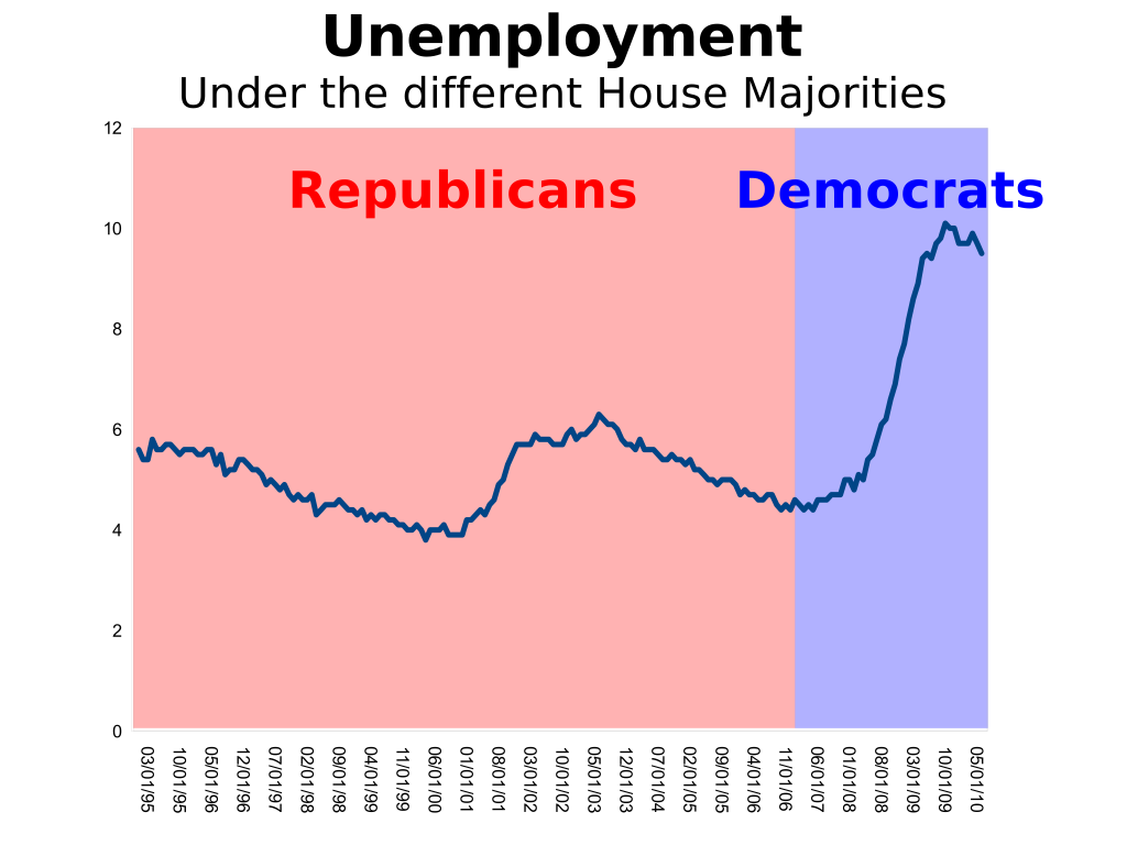
Source: Red State
>
A friend writes: “What do you do when presented with a chart such as the one above?”
My answer was simply that it depended upon who is showing you the chart:
• If it comes from a hard core partisan, you laugh at the flaws in their wetware and say nothing. Recognize they are not capable of comprehending logic or objective reality, and can only respond to emotional narratives.
• If they are a student, or anyone genuinely interested in markets, economics, or probabilistic analysis, you ask, in your best Socratic method, the questions below.
• If they are an investor, you simply take their money.
Sports fans, Partisans — anyone emotionally invested in any specific outcome — lose the ability to objectively judge reality. Studies have shown that their brains appear to have a form of damage similar to aphasiacs. But there is no physical damage, it is merely inherent flaws built into the wetware.
To investors, this is a devastating problem, one that eventually will become terribly expensive if they do not learn how to compensate for it. The psychological term for this is selective perception. I love tracking down examples of this at work, as it reminds me how we are all wired in a way that is filled with cognitive flaws. Investing enlightenment only is possible once you objectively recognize and learn to work around the inherent flaws in your wetware.
This chart — which is hysterically funny to anyone who can objectively review economic data — reveals pretty much nothing about either politics or unemployment. But it reveals everything about the cognitive errors of the person who drafted it.
Let’s return to our student, or anyone genuinely interested in this data: See if your wetware can answer these questions. Once you have done that, go back and review the chart again:
1) Is this time period unique or typical? Do other eras share a similar relationship between the two variables?
2) Is there a causal relationship between the two variables? Asked another way, does the House Majority significantly impact employment, or is this merely a classic example of correlation without causation?
3) What other factors might impact employment more significantly than House Majority?
4) Is there a similar relationship between White House and Unemployment? How about the Senate and Unemployment?What do these relationships reveal about the original two variables?
5) Why such a small sample? We have been tracking unemployment for many decades, along with House majorities — What does using the complete data set reveal?
6) What about other employment related data? How do wages, long term unemployment, job mobility, and labor force participation rate compare to House Majority? What about GDP, balance of trade, inflation, deficits, etc?
7) What other ways are there to consider the data? Does a peak-to-peak or a trough-to-trough measure of unemployment change the outcome of the relationship between variables?
8) What about other time periods? Does the relationship in the chart hold true for periods of 5, 10, 20, 25 or 30 year periods?
In my business, I cannot allow my personal political preferences to interfere with my ability to form a coherent and objective view of reality. Whatever the business of the person who createdthis chart is, objectively reality does not matter much.
I only hope they are active participants in the stock market . . .


What's been said:
Discussions found on the web: