The Bureau of Labor Statistics just released its most recent Job Openings and Labor Turnover (JOLTS) data, and the number of job openings increased to 3.4 million (from 3.0 million last month; it was a gain of +351k openings, to be precise). Consequently, the number of unemployed per job opening has declined from 6.25 (Oct. 2009, which was the cycle peak) to a current 4.41. This is a positive development (as noted by the BLS headline: Job openings in October highest since August 2008) , but there is still much more work to be done.
For those who relish the chart porn (and who doesn’t?), here are a couple of graphs that get to the heart of the matter (all data via BLS.gov):
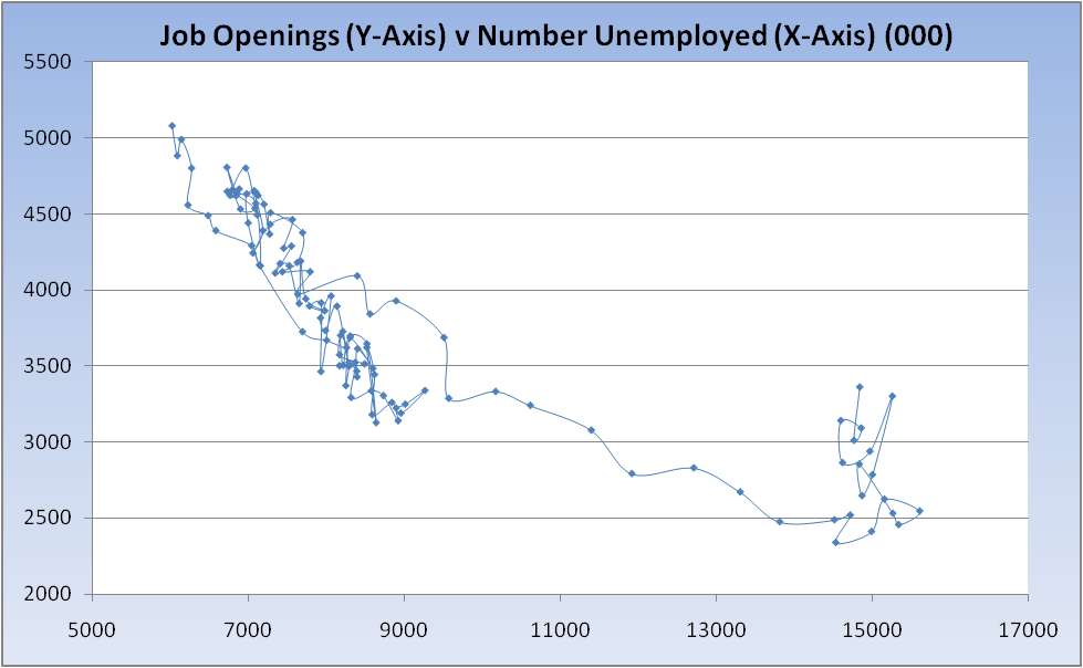
Sadly, while the chart above reflects some improvement in the labor market, it would appear that improvement is coming almost entirely from an increase in the number of job openings (denominator) and not a decrease in the number of unemployed (as we see month after month via the BLS Household Survey). That picture is captured below, in which I plot the number of unemployed against the number of job openings (referred to as the Beveridge Curve, though that generally references the job vacancy rate and unemployment rate):
The place to be in the chart above is the upper left quadrant (i.e. jobs plentiful with few unemployed). Unfortunately, as the recession took hold, we moved gradually to the lower right quadrant (few job openings and high number of unemployed). While our line now appears to be moving higher, we need to see it also move to the left, signifying a decline in the number of unemployed, and that’s not happening (yet).


What's been said:
Discussions found on the web: