These are some of the more interesting charts that I’ve seen since Friday’s NFP (if you have any suggestions, make them here and I’ll add the best of the lot):
>
Comparing Recoveries
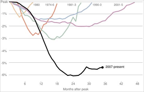
Courtesy NYT
~~~
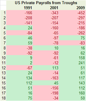
Monthly Payroll Since NBER REcession End
~~~
Temporary Help

via Bruce Steinberg
~~~
Employment Data
Via NYT
~~~
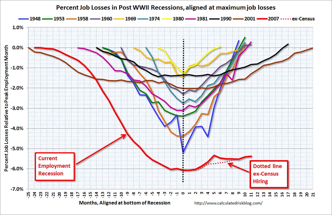
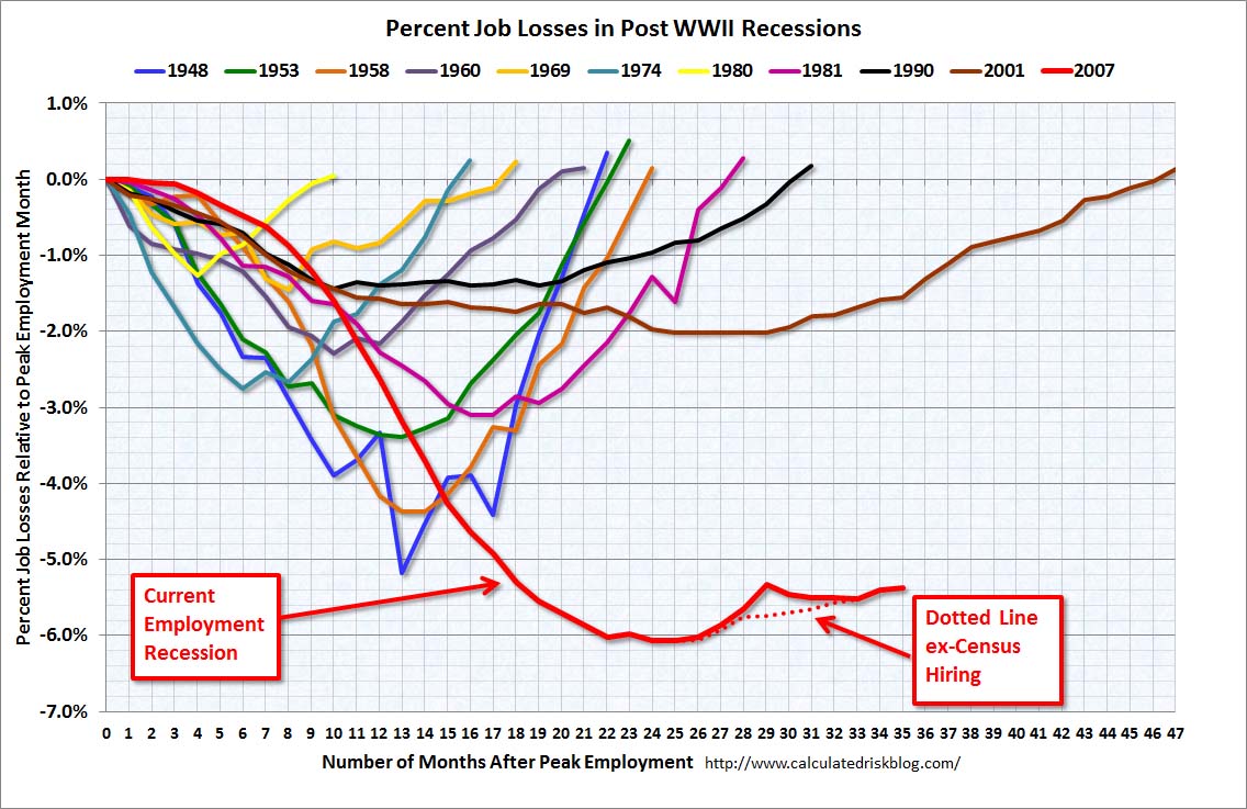
Percentage Job Losses, past Recessions
Via Calculated Risk
~~~
Percentage Change From Recession End

via Chart of the Day
~~~
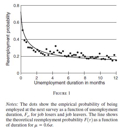
Unemployment Duration (Months)
Via Economix
~~~
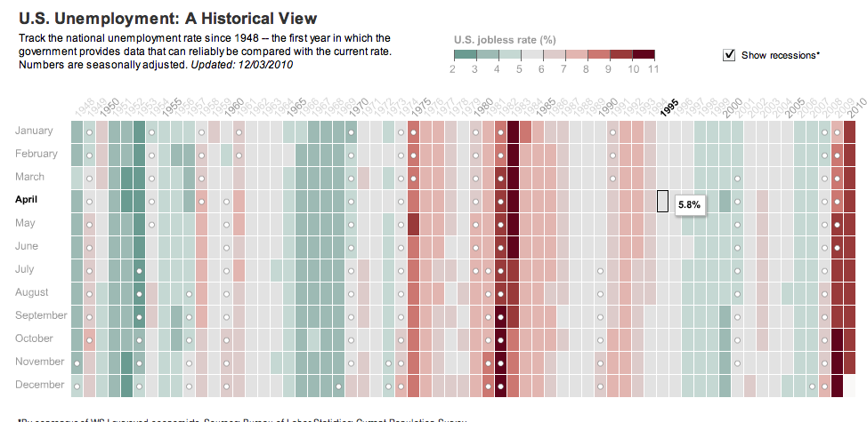
Historical (interactive) Chart
via WSJ
~~~
via Calculated Risk
~~~
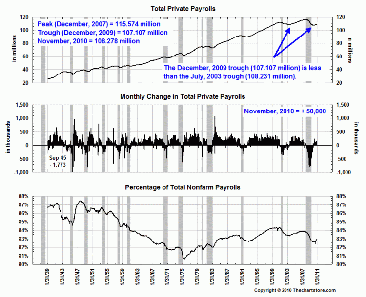
Total Private Payrolls
via The Chart Store
~~~
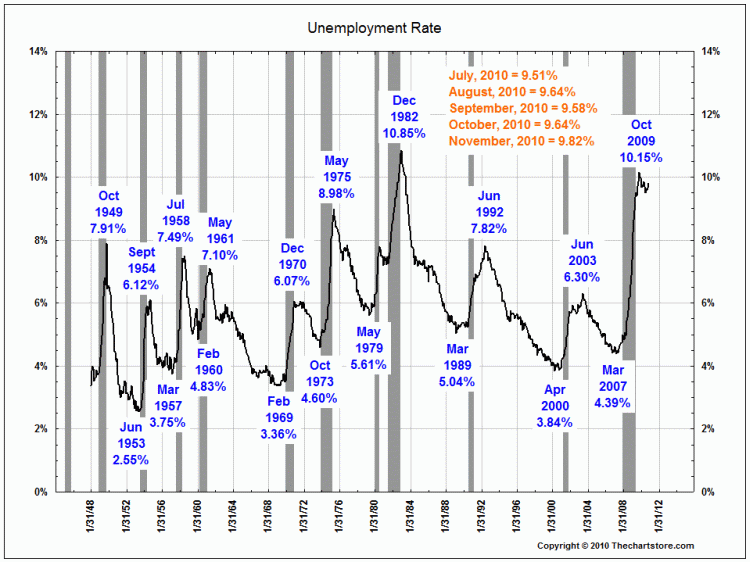
U6 Unemployment Rate
via The Chart Store



What's been said:
Discussions found on the web: