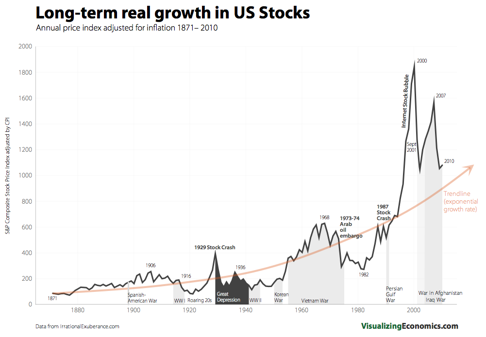
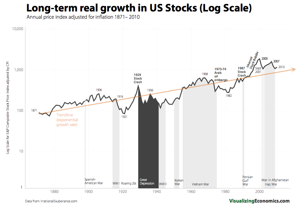
I was kicking around some of the outstanding charts at Visualizing Economics, when these two below leapt out at me.
The first chart shows the long term growth of the US stock market, using a smoothed exponential trendline, while the second adjusts the overall chart using a log scale.
As I look at these two charts, a few things stand out to me:
• Mean Reversion cannot be denied;
• Growth Rates over very long periods of time are remarkably consistent;
• This consistency is likely controlled by a combination of numerous inputs, e.g., specific factors such as GDP, Population growth, Earnings, Interest rates, etc.;
• Stocks can remain above or below “Fair Value” for extended periods of time;• Reversion to the trend rarely occurs through sideways market action;
• Markets careen through their historical trend lines to levels far below and far above what seems “normal.”
Note that these are not the sort of charts that lead to an immediate trading decision; rather, they should color your long term expectations as what might occur in the intermediate future.
>
Charts via Visualizing Economics (here and here)
Data from Irrational Exuberance


What's been said:
Discussions found on the web: