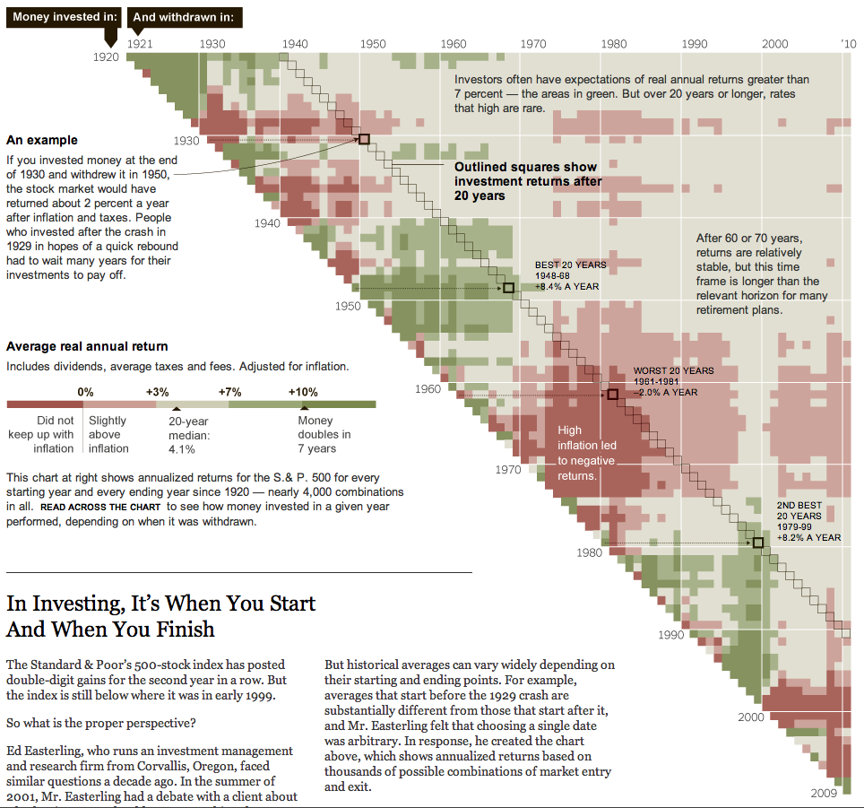
One of the things I frequently reference is the long term secular periods of bull and bear markets. Holding onto a broad basket of stocks for 10 or even 20 years is not a guarantee of positive returns.
The matrix below was developed by Ed Easterling of Crestmont Research. It shows the outcome of your returns over fairly long periods of time.
Use the diagonal to select your start date; yous the horizontal axis to select your “withdrawal” date. Where the 2 meet shows your returns: Red means returns failed to keep up with inflation; gray red is slightly above (0-3%); gray is 4-7%’ light green is 7-10%, while green is 10% plus.
>
>
Sources:
Stock Market Matrix
http://www.crestmontresearch.com/content/Matrix%20Options.htm
In Investing, It’s When You Start And When You Finish
NYT, January 2, 2011
http://www.nytimes.com/interactive/2011/01/02/business/20110102-metrics-graphic.html


What's been said:
Discussions found on the web: