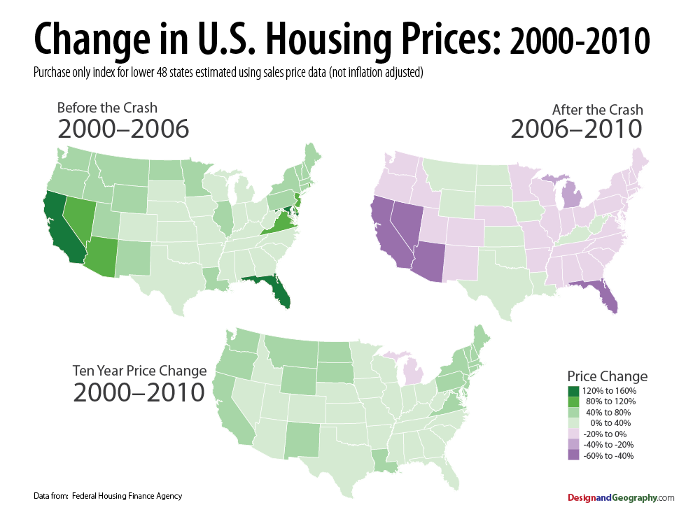
Great set of charts from Visualizing Economics, showing the 2000-06 period, the 2007-11 collapse, and the c0ombination of the two.
My one beef is with the phrase Housing Bubble. As the charts show, the bubble was very specifically limited to a handful of regions. Nationally, we had a Housing boom & bust — but the “bubble” was in Credit. This was thanks to Greenspan’s ultra-low rates, the abdication of lending standards, that were driven by the demand to feed the Wall Street securitization machine.
Anyhow, here is what the price changes look like mapped out:


What's been said:
Discussions found on the web: