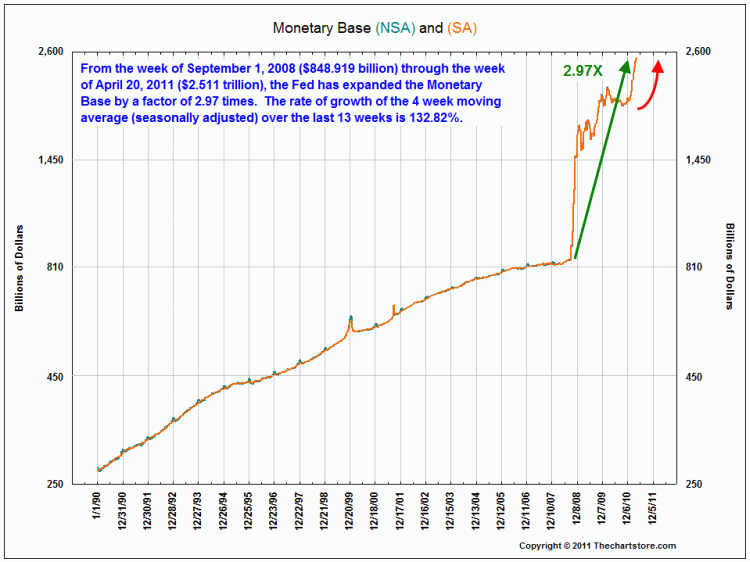
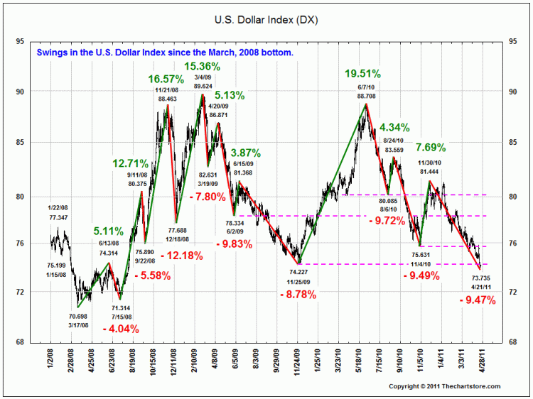
I found these two charts rather fascinating: The first shows the overall increase in the Monetary base since 1990.
It was expanding for 18 years at a pretty good clip — then it exploded with the financial collapse in 2008. The 2nd chart shows swings in the dollar index since then.
All charts courtesy of The Chart Store
>


What's been said:
Discussions found on the web: