>
NFP week continues here at TBP.
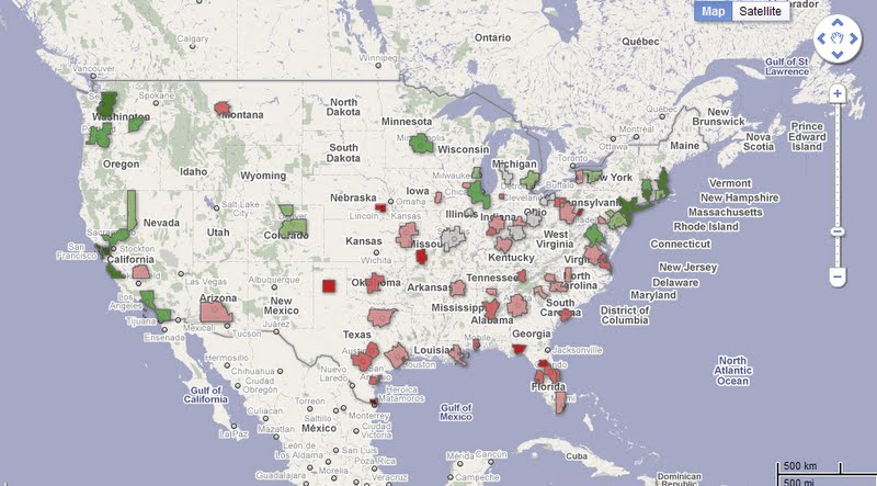
Our latest chart p0rn: This WSJ interactive map of wage growth (or the lack thereof) across the US of A
>
Source:
Comparing Wages Across the U.S.
Sara Murray
WSJ, May 25, 2011
http://blogs.wsj.com/economics/2011/05/25/comparing-wages-across-the-u-s/


What's been said:
Discussions found on the web: