>
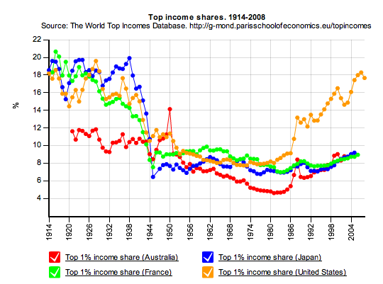
The chart above shows how far things have moved off their traditional ratios in terms of US incomes. The top 1% are earning more income, and keeping more of it, than anytime since the roaring 1920s.
This fascinating set of data points via the Paris School of Economics (referred to us by Invictus!). You can access this via their website and slice and dice the income data by nation, income percentile, etc. anyway you like.
As the Authors note:
The world top incomes database aims to providing convenient on line access to all the existent series. This is an ongoing endeavour, and we will progressively update the base with new observations, as authors extend the series forwards and backwards. Despite the database’s name, we will also add information on the distribution of earnings and the distribution of wealth. As the map below shows, around forty-five further countries are under study, and will be incorporated at some point (see Work in Progress).


What's been said:
Discussions found on the web: