Two interesting long term charts to help put today’s action into a bit of perspective: Both of these are sourced from JP Morgan funds:
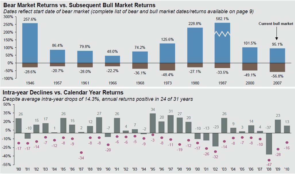
The first chart shows various US Bear markets since 1980, and the Bull markets that followed. That may be cold comfort to people who are caught leaning the wrong way today, but its a reminder that “This too, shall pass.”
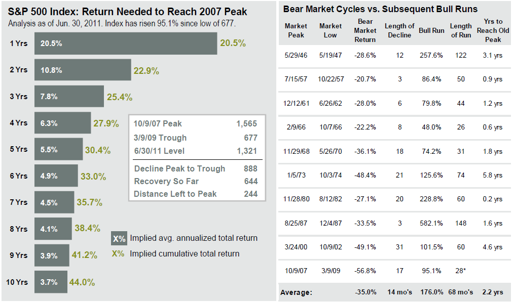
The second chart shows what it will take to recover the 2007 peak (note this is dated June 30th, and thus is from higher levels. Add 10% or so to the numbers).
>
~~~~

Source: BLS, FactSet, J.P. Morgan Asset Management.
Data reflect most recently available as of 6/30/11.
Source: JP Morgan funds
Interesting stuff!


What's been said:
Discussions found on the web: