(All the following charts, tables and schematics are pictures that can be easily enlarged by clicking on one of the two right-hand corners and dragging the little circle.)
Nearly every equity money manager, and even most hedge funds, have losses since the May 2 stock market high. So, of course, they would have been better off if they had at least 90% in cash during that past five months. But we’ve recommended a better strategy – more complex, but much less volatile – if you or your clients were holding cash positions at least equal in size to their equity short positions.
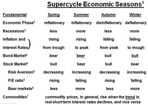
On a long-standing basis during this Supercycle Winter Period (defined in a table at the bottom), we’ve recommended money market funds, which used to have a high enough interest yield to cover advisory fees since they’re also necessary to dampened the portfolio volatility when they’re positioned in high betas mutual funds or ETF/ETNs. Also, the cash position was importantly available for additional buying opportunities that arise in highly volatile markets.
The necessary timing for these opportunities are not-so-predictable well in advance as are our primary positions have been for the past dozen years or so – like short stocks and the U.S. dollar, and starting three years ago at their highs, short China (equities) and commodities – and long bonds (now a 30-year bullish call) and precious metals. But the much shorter term opportunities are recognizable when they periodically occur if you have the right timing tools.
Different than simply being in cash since May 2, our recommendation was for being short the stock market and then anticipating its Aug 9, buying offsetting long positions. This hedging strategy has captured a profit during those five months. Importantly, this gain occurred with nearly no portfolio volatility during a highly volatile environment.
When the partial retracement rally that we anticipated, which re-ignited Tuesday, tops outs we expect to profitably close the long position in the recommended hedge. This will create a 50% cash position again, and leave the other 50% in the equity short position for the rest of the bear market. We expect the bear market to be a class 5 in severity as explained below. It will most likely end just before next year’s Presidential election when the double-dip recession is obvious and feared by nearly every investor and everyone managing money. During the about 12 months until then, we will look for additional doubling-up hedge opportunities that are likely to occur another few times even though the necessary timing is not-so-predictable from now.
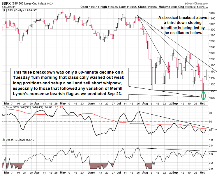
A continuation of the retracement rally following the Aug 9 low has been quite contrary to the subsequently developed consensus expectation that breaking that low will bring on the rest of a bear market. This consensus developed because most all pure technicians, and fundamentalists also using technical analysis, missed the mini-crash Aug 9 low. They’ve been looking for a further significant breakdown so they could be at least partially “right,” if not also profitably grab some of that breakdown decline.
But our work shows that Tuesday morning’s break of that low especially, because the consensus did not expect it to last less than one day – the declining portion was only about 30 minutes – has probably created a major whipsaw for them. This will likely then compound their previous five-month losses as they scramble in the days ahead changing their collective minds and cover their short or short-like positions not wanting to lose any more in those positions. This will be in addition to fearing that they are missing an upside opportunity to make up for their post-May 2 losses especially during the early-Aug mini-crash.
To understand this whipsaw situation, note that the most important chart patterns reflect the fundamental shocks of the piling on of a pre-mature fear that bear-market induced recession may have started along with a possible parallel of the Eurozone sovereign debt crises with certain aspects the previous U.S. financial crisis. However, the most important chart patterns since the Aug 9 low – not the faux bearish flag pattern for the whole stock market that we discussed in our September 23 email to you – are not only quite technically different from each other, but the have simultaneous endings (explained below) that are key to understanding what has been occurring fundamentally. Even more important, they reinforce each other in their combined likely outcome for the whole stock market immediately ahead.
In other words, if all sectors of the stock market had been exhibiting essentially the same technical chart pattern then the rally from the Aug 9 intraday low at SPX 1102 would have ended at the SPX 1231 intraday high back on Aug 31, which was the minimum 50% retracement rally that we called for at that mini-crash low in the email we sent you on Aug 9. This is what most all technicians, and fundamentalists also using technical analysis, have cumulatively come to believe before Tuesday’s low. But we don’t agree for the following reasons.
First, they think the high inter-market, inter-sector and inter-industry correlations during the early-August mini crash means that there is important chart pattern for the whole stock market. We do not believe that is true. (More about what you should know about correlations further below. We had long predicted that the crash in the housing market would be exaggerated by the failure of financial institution’s “correlation desks” that were trading CDOs because they did not adequately understanding correlation.)
Second, the importantly different chart patterns clearly show up when the strongest and weakest markets, sectors, industries and even individual stocks are contrasted. Of course there is always some difference in making these strongest vs. weakness comparisons, but this time the difference is very significant and critical from a market timing point of view since those two different chart patterns suggest the same immediately outcome: that a significant extension of seemingly dead-in-the-water partial retracement rally since the August 9 low probably started at Tuesday morning’s low.
The most relevant example of these two different patterns is at a Supercycle time horizon level, which is illustrated in the two stacked charts below. The U.S. stock market of exchanged-traded common stocks, on a capitalization-weighted basis, can be bifurcated into the financial-laden NYSE Composite and the technology-laden Nasdaq Composite. Since the 2000 highs in each index the chart patterns are similar and different in important ways. Their five major trends during the past 11 years have similarly timed directions: first down, then up, then down, then up, and since May 2 they have both been going down again. But note when comparing the two charts below that their sequential highs and lows are relatively opposite. That is, the blue and red high-to-high dashed lines and the black low-to-low dashed lines have opposite slopes.
Before we bring these type of distinctions into shorter term focus in order to explain why we expect that following Tuesday’s mornings low the stock market probably started what will likely be a significant extension to the seemingly dead-in-the-water partial retracement rally since the August 9 low, we note the following with respect to our previous bear market forecasts.
Before the start of the last major bear market for the whole stock market – the 17-month, 57% decline in the SPX from its Oct ‘07 high to its Mar ‘09 low – we warned it would probably exhibit a Class 5 severity in magnitude and duration. (See our updated Severity Profile Grid further below defining and historically illustrating five classes of bear markets, in addition to Pullbacks, Corrections and Crashes). And we expected it would be the first Class 5 bear market for the financial-laden NYSE Composite, which it certainly was declining 60% over 17 months. But during the 30-month, 78% decline in thedot.com bust as reflected by the technology-laden Nasdaq Composite from its Mar ‘00 high to its Oct ‘02 low, the technology-laden Nasdaq Composite experienced only a Class 4 bear market. And we fully expected the NYSE Composite would catch down – at least significantly – with the Nasdaq Composite by breaking below its Oct ’02 lows, which it did as can be seen in the two stacked charts above.
In our Sep 23 email to you, we pointed out that the different technical chart patterns in these two market indexes were key to understanding what’s been occurring at least since May 2, and, much more important, what is likely to happen to the whole stock market, at least on a short term (a few to several weeks) and intermediate term (a few to several months) basis.
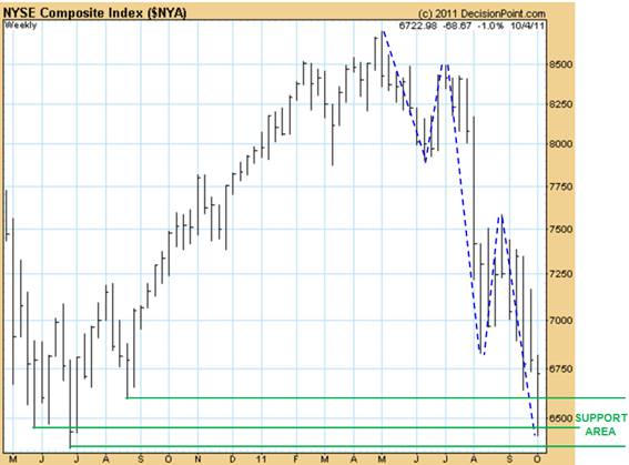
Here is the key Growth Cycle pattern with an update of the fifth and final swing of a 12345 downtrend (blue dashed lines) in the financial sector-laden NYSE Composite:
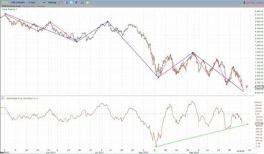
Below is the $NYA in two-hour bar chart detail with bullish divergence in a representative, velocity-like oscillator:
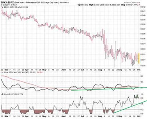
Since the NYSE Composite is being driven by the dramatic weakness in financial sector, largely because of contagion fear with the Eurozone’s sovereign debt crisis, we note that the banking index (BKX) has now retraced 47% (arithmetically) to 62% (geometrically) of its more than three-fold gain from its Mar ’09 low, which is a normal range for a partial retracement rally to typically start. The relative weakness in the banking industry has been appropriate because even though a sovereign debt contagion, even in the Eurozone, is not likely because our work also shows that banking industry earnings will be relative underperformers for many more years. So a sharp short squeeze-driven rally in banking stocks and other financial sectors that collectively have significantly broken their Aug 9 lows was appropriate even though there’s enough information now to substantially doubt that the inevitable restructuring of Greece’s sovereign and private sector bank debt will be chaotic and/or globally contagious.
This is supported by the fact recent month’s improvement in the BKX’s relative weakness – believe it or not – indicates that a low in the whole stock market is imminent. In the chart below, note the positive divergence that started 1.5 months before its Aug low as illustrated by the green lines in the two lower panels of oscillators, which are very similar to the velocity, or the first derivative, of price.
We do not expect a bottom for a subsequent bull market in the banking industry or financial sector, but rather a potentially bullish setup has been developing for a potentially enormous short squeeze consistent with a ball bouncing downstairs. That is, the coming extension of stock market’s rally that started at Tuesday morning’s low, and especially the oversold BKX and financial sector, will likely be a “much bigger bounce from a much lower step,” but we fully expect it will still make a lower high than May 2 when the rally tops out, to be followed by lower lows continuing its Supercycle Bear Market severity downtrend.
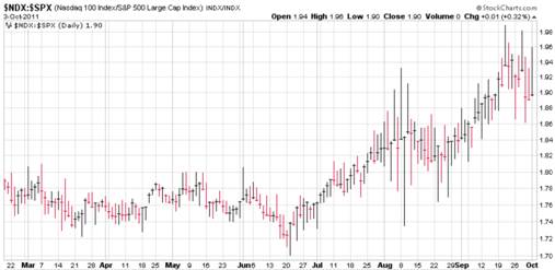
In this case, although the Supercycle Bear Market in the BKX and financial sector will likely not end earlier than the end of overall stock market’s Class 5 severity bear market that we believe started at the May 2 SPX 1371 high, the coming BKX and financial sector’s likely explosive rally will support, if not lead, an overall stock market rally, along with the heretofore strongest sectors and industries (e.g. Nasdaq 100 and retail stocks – see their relative strength charts below – (utilities do not have enough volatility to “play”), that more significantly retraces, but only partially, the SPX decline from 1371 on May 2 to its Oct 4, Tuesday, low at 1075.
Third, keep in mind that successful technical tests of a market bottom also include those that make minor new lows, like that which just occurred, as well as what could happen during the next few days, although unlikely (more below in Coming Bullish News In Unemployment and Employment). Analogy: heaven and hell are not separated by a narrow, clear line. There should be a varying gradient in all logical constructs.
Bullish News In Unemployment and Employment
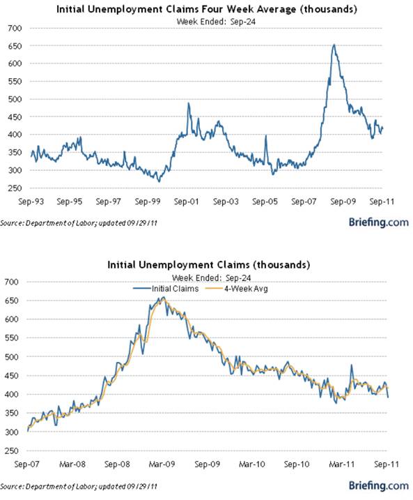
We expect the stock market will react bullish to the following, and especially their combination: ADP’s monthly private payroll (reported Wednesday), weekly initial unemployment claims (reported Thursday) and the monthly payroll and household employment data (reported Friday). Although last week’s IUC bullish data may have been exaggerated with seasonal adjustments, the four-week moving average will still likely bullishly decline, and probably at least for the following couple of weeks. Recall that IUC is a leading economic indicator like the stock market so that they are coincident to each other on average. Their negative correlation is 50% when the eight-week changes in each are compared.
Note how bullish the initial unemployment claims data (inversely) is for the stock market by being below its peak for the past several weeks.
Understanding Our Correlation Puzzle Is Important
Much has been made about the high correlation between global markets, sectors, industries and even individual securities. This causes to many analysts and investors to think the corresponding chart patterns are (must be) the same so that technical analysis of the whole market is good enough to beat the market. The stock market is much more efficient that generally believed by non-academics , so such group-think is not good enough.
The attached set of six Excel charts show, among other things, how two time series – one in an uptrend and the other is a downtrend – can be perfectly correlated (+100.0%). The point is that correlation does not necessarily measure the similarity, or lack thereof, of chart patterns. However, similar chart patterns are highly correlated when the conventional correlation function (the default one on most all spreadsheets) is used properly, which is not very often by Wall Street and hardly ever by advisory services.
Supercycle Bear Markets and Periods
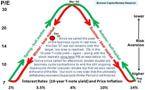
Don’t confuse a Supercycle Bear Market with a Supercycle Bear Market Period, which is a typically 16 +/- four-year period of serial (several) Supercycle Bear Markets. A Supercycle Bear Market Period is the extent of one of four serially-connected economic periods, which we call Springs, Summers, Autumns and Winters (like currently). Here’s a schematic fundamental defining and identifying each.
1. Over many years we’ve documented our discussions with others who have used the terms K-Cycle, Kwave, Kondratieff (Kondratiev) Wave or longwave with Season(s), and the like. Our decades-long publishing record clearly establishes that we were the first to use these terms with Season(s), as well as the first to quantify them economically and otherwise fundamentally (Kondratieff and Schumpeter did not) and even technically. Most importantly, we were also the first to forecast their applicability to the secular period dating variously from the late 1990’s through March 2000, depending on the metric under consideration – see As Forecasted – A 12-Year Retrospective <http://www.financialsense.com/editorials/bronson/Forecast.pdf> We more than welcome further inquires.
2. The Supercycle Summer and, especially, the Supercycle Winter have only a fraction of the economic growth of the Supercycle Spring and Autumn due to the increased severity (magnitude times duration) of recessions, or more accurately, business-cycle contractions during Summer and Winter.
3. The terms “more“ and “less” refers to the combination of cyclical frequency and severity (duration times magnitude) – see SMECT: A Forecasting Model That Integrates Multiple Business and Stock Market Cycles Since 1896 <http://www.financialsense.com/editorials/bronson/Model.pdf>
4. The terms ““bull” and “bear” refer to the over- and under-performance in Supercycle (secular) trends of excess total return compared to the risk-free return and other asset classes.
5. P/E includes quantification of investor mood (animal spirits) – see our earnings-capitalization stock-market valuation model: Quantifying and Forecasting an Equity Risk Factor<http://www.financialsense.com/editorials/bronson/2007/0412.html>
6. See our severity (magnitude and duration) quantification of the 33 most severe bear markets since 1895: Exhibit E in #3 above.
7. Here’s a link to our report Sell Commodity Indices<http://www.financialsense.com/contributors/bob-bronson/sell-commodity-indices>, which demonstrates that commodity price indexes, like the CRB, are much more inversely correlated to the trend rather than the absolute level in real (inflation-adjusted) short term interest rates. Precious metals, especially gold, are more responsive to trends in the U.S. dollar, and the most economically important commodity, oil, which is still primarily priced in the U.S. dollar, is also very reactive to global political events.





What's been said:
Discussions found on the web: