Friday’s release of GDP prompted me to get back to the keyboard. I confess that between my day job and musing about economic issues for TBP and @TBPinvictus, I have been time challenged. I’ve been leaning toward the one that pays the bills.
Back to Friday’s GDP data: 2.8% was weaker than expectations, and the guts were weaker still. Dean Baker does a very nice job explaining the weakness here.
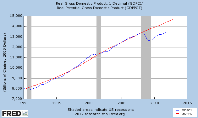
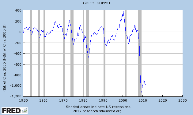
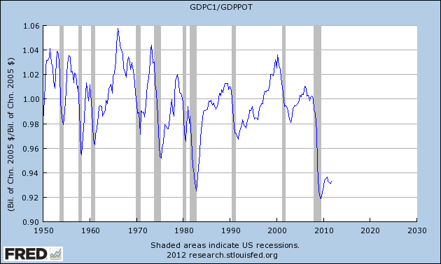
A few simple charts show the magnitude of the hole we’re still struggling to dig out of. All three involve Real GDP and Potential GDP; we’re just getting three distinct views.
At this point, Real GDP and Real Potential GDP are running roughly parallel to each other — we’ll obviously never close the gap with that being the case:>
We still have a “hole” of almost $1 trillion dollars of slack in our economy:
That $1 trillion of slack represents a deficit of about 7% off our potential.
A few noteworthy comments on GDP:
Via Catherine Rampell’s Twitter stream I learned that “2011 overall was the slowest non-recessionary year of GDP growth since 1947, says Neal Soss of Credit-Suisse.”
And from Stephanie Pomboy, via Alan Abelson in Barron’s, we learned that:
“Fully 1.94 percentage points of the 2.8% GDP number came from an inventory build (just the kind of hefty involuntary rise, we might add, that often is followed by a contraction as companies trim their excessive stocks of goods). That means, Stephanie says, that real final sales were up a feeble 0.8%. And that figure benefited significantly from a big jump in auto purchases that all by itself chipped in 0.3 percentage point to GDP.”
To quantify Mr. Abelson’s parenthetical comment: Historically speaking, there appears to be about a 68 percent probability we’ll see an inventory contraction for the first quarter. In the past 52 years — 208 quarters — inventories contributed more than 1.75% 40 times (a 1-in-5 occurrence). Of those 40 times, the following quarter showed contraction in inventories 27 times.
Among our ongoing trouble spots, of course, is the housing market, which at this point seems to be bouncing along what we all hope will be the bottom. One category measuring activity in that sector is Private Residential Fixed Investment (PRFI), which peaked in early 2006 at $813 billion (SAAR). It is now about 42% of that level — at $346 billion (SAAR), and has been running at roughly 60 percent of the level it was at when we slipped into recession (i.e. the economic peak) in the fourth quarter of 2007. Below is a chart demonstrating exactly how weak housing is relative to other recessions:
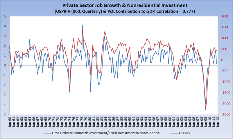
With my primary concern always being a focus on creating jobs, I took a quick historical look at the components of GDP to see what line item correlates most closely to private sector jobs (USPRIV at the St. Louis Fed). Here is what I found, with a brief explanation below. The chart shows quarterly private sector job growth/contraction in thousands (red, right hand scale) vs. percent contribution to overall GDP by Gross Private Domestic Investment/Fixed Investment/Nonresidential (blue, left hand scale), which represents roughly 10 percent of GDP:
What correlates most closely to private sector jobs is Line 9 of the GDP tables: Gross Private Domestic Investment > Fixed Investments > Nonresidential. The correlation is 0.777. The bad news is that, as a percent contribution to overall GDP, this metric just printed its worst number in the past 8 quarters, or since the recovery was getting established:
| 2009-3 | 2009-4 | 2010-1 | 2010-2 | 2010-3 | 2010-4 | 2011-1 | 2011-2 | 2011-3 | 2011-4 |
| -0.29 | -0.33 | 0.56 | 1.62 | 1.04 | 0.82 | 0.20 | 0.98 | 1.49 | 0.18 |
To add a bit of color, please have a look at the BEA’s guide to its tables, focusing on Page 9:
Nonresidential fixed investment consists of both structures (1–22) and equipment and software (1–23).
Nonresidential structures consists of new construction (including own-account production), improvements to existing structures, expenditures on new nonresidential mobile structures, brokers’ commissions on sales of structures, and net purchases of used structures by private business and by nonprofit institutions from government agencies.19 New nonresidential construction includes hotels and motels and mining exploration, shafts, and wells. Nonresidential structures also includes equipment considered to be an integral part of a structure, such as plumbing, heating, and electrical systems.
Equipment and software consists of purchases by private business and by nonprofit institutions of new machinery, equipment, furniture, vehicles, and computer software used repeatedly, or continuously, in the processes of production for more than 1 year. Also included are dealers’ margins on sales of used equipment to business and to nonprofit institutions; net purchases of used equipment from government agencies, from persons, and from the rest of the world; and own-account production of computer software. For equipment that is purchased for both business and personal use (for example, motor vehicles), the personal-use portion is included in PCE.
Lastly on this point, the widely cited change in inventories (see above) only correlates about 0.28 with private sector jobs. I’ll be keeping an eye on this as we move forward.
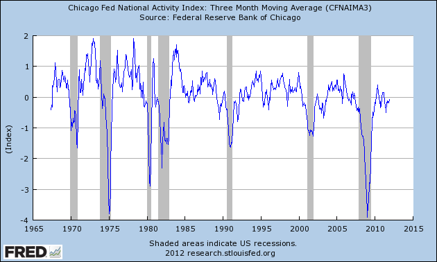
And no discussion of the macro picture is complete without a mention of the Chicago Fed’s National Activity Index, which also printed last week at 0.17, with the more closely watched 3-month moving average ticking up to -0.08. (My first Big Picture post about CFNAI appeared here exactly two years ago, and remains a good introduction to the metric.)
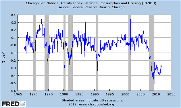
What ails us is generally the consumer and housing, as evidenced by that sub-component (one of four) of the overall index. C&H has printed negative for an astounding 60 consecutive months, its last positive print occurring in December 2006.
This is all by way of saying there’s nothing cosmic or extraordinary going on — and there needs to be. We’re mired in a slow-growth, fragile economy that could be easily derailed by any unexpected exogenous shock (looking at you, Europe).
I have to point out here that I chafe when I read about where we’re “supposed” to be economically four years after a normal recession’s inception or two-and-a-half years into a normal recovery. There was simply nothing normal about the recession that began at the end of 2007, and to compare this recovery to recoveries from anything other than the Great Depression is to commit a tremendous disservice. I see economists do this all the time, all of whom know better. It is just not a fair, apples-to-apples comparison. Barry has written about this, but I felt compelled to add my two cents.
Finally, I pointed out some time ago (November 30) on Twitter that there was an SPX Golden Cross in the offing. That moment is now upon us (the Dow’s occurred a short while back). I leave it to Birinyi and Bespoke to shower us with the implications of this milestone (and there are many, and they are generally positive). (BR: I have lots of good data on this; I’ll post something before lunchtime today)
Busy week upcoming on the economic front, culminating with the Employment Situation report on Friday. Never a dull moment.
And, a caveat: GDP will get revised in February, and again in March. So much of what appears above is, obviously, subject to change.



What's been said:
Discussions found on the web: