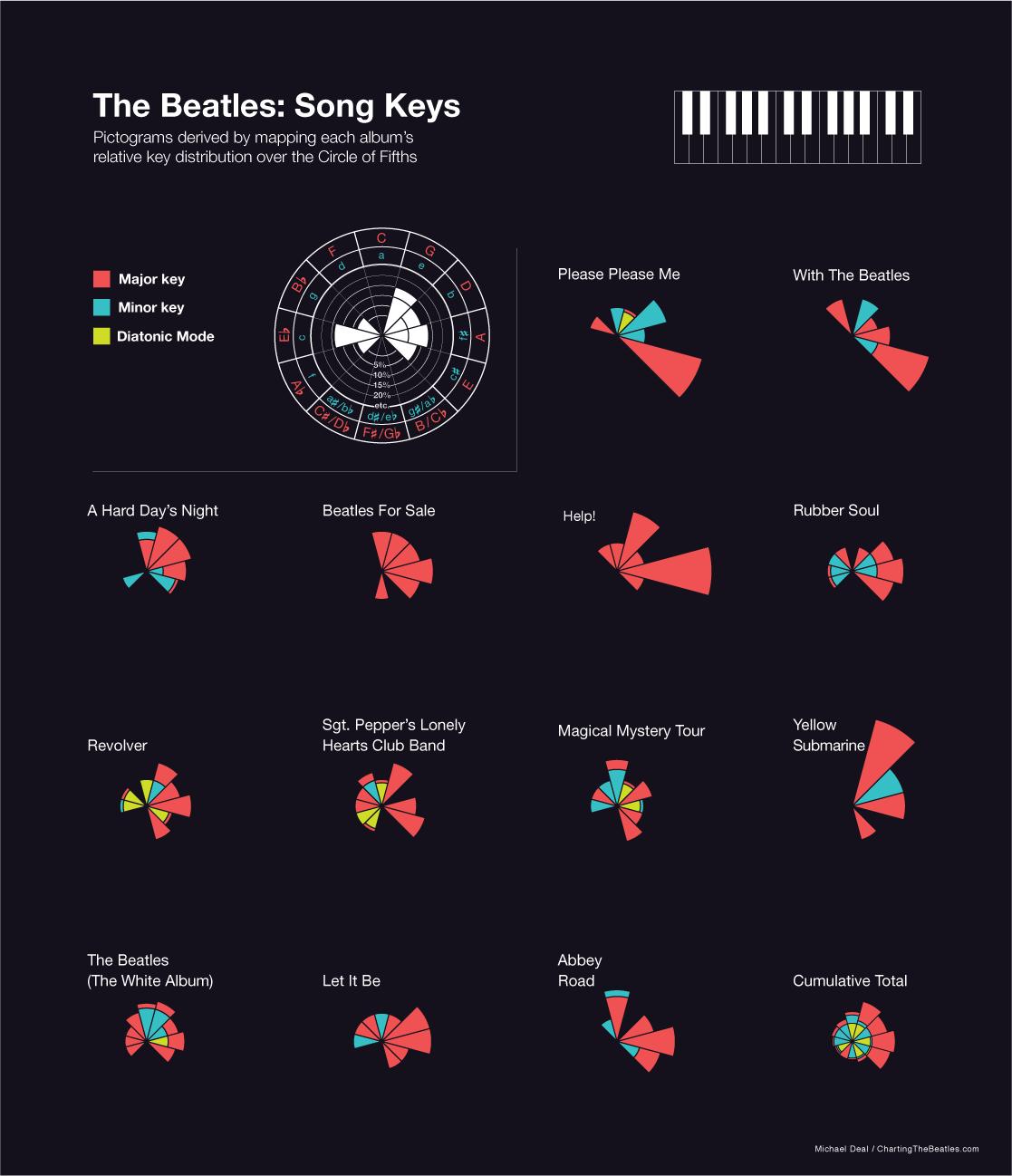
The shape of these pictographs is defined by what keys the songs were recorded in for each album. The relative distribution of keys (with mid-song key changes considered) have been mapped over a graph framework based on the Circle of Fifths. The pictographs are in order of album recording.
Source:
Charting the Beatles
Michael Deal


What's been said:
Discussions found on the web: