I have mentioned Ron Griess and The Chart Store countless times, but I have to give them mad props again. The depth of their chart collection, combined with the weekly updates/blog are invariably interesting, informative and insightful.
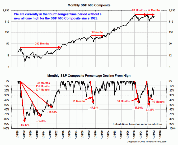
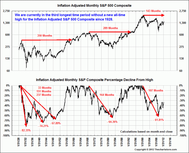
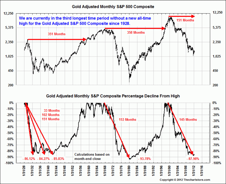
These four charts below are just the sort of Big Picture, long cycle perspective that so many investors overlook or simply have no knowledge about. These charts are not about making predictions, but rather, are about putting market action into some broader historical context. What has happened in the past? What is typical? Aberrational?
His service is $239 a year, and its a bargain. (This is an unpaid, unsolicited endorsement).
>
Nominal, Inflation Adjusted, Gold Adjusted and Silver Adjusted
Compared to the All-time High of Each Series
˜˜˜
~~~
For those not familiar with the calculation, the Gold Adjusted price is the S&P/Gold Ratio times the most recent price of the S&P, in this case February month end price.
˜˜˜
Some complain about the fixed price of gold until the late 1960’s. To counter that concern, we present a similar chart using silver. Silver freely traded during the whole time period from 1928.


What's been said:
Discussions found on the web: