Invictus here.
A few items of interest (I hope) that I’ve been thinking of lately.
What Type of Jobs Recovery Are We Having?
Everyone’s seen Bill McBride’s employment chart, which he dutifully updates every month (along with just about every other economic release that comes out). Bill’s chart shows the percent change in employment relative to the peak month. And there is simply no denying its ugliness.
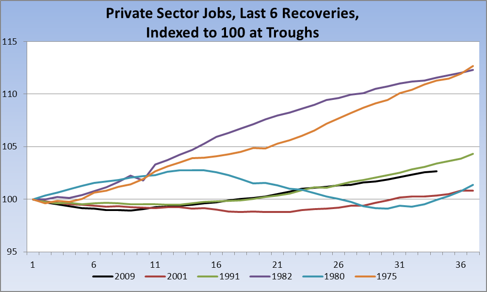
However, the picture is a wee bit different when we look at the actual recovery, which is to say if measure job growth from the trough and not the prior peak:
Source: St. Louis Fed, Series USPRIV
What we clearly see is that, from a trough-to-date perspective, we’re tracking almost spot-on with the 1991 recovery and, yes, ahead of the Bush Boom recovery. Of course, lest I get skewered, this is not at all to say that I find this recovery in any way satisfactory. It is not. However, as I’ve said many times, if anything was really different this time it was the depths to which we plumbed, not necessarily the pace of the recovery. This chart supports that thesis.
Dividends vs Interest
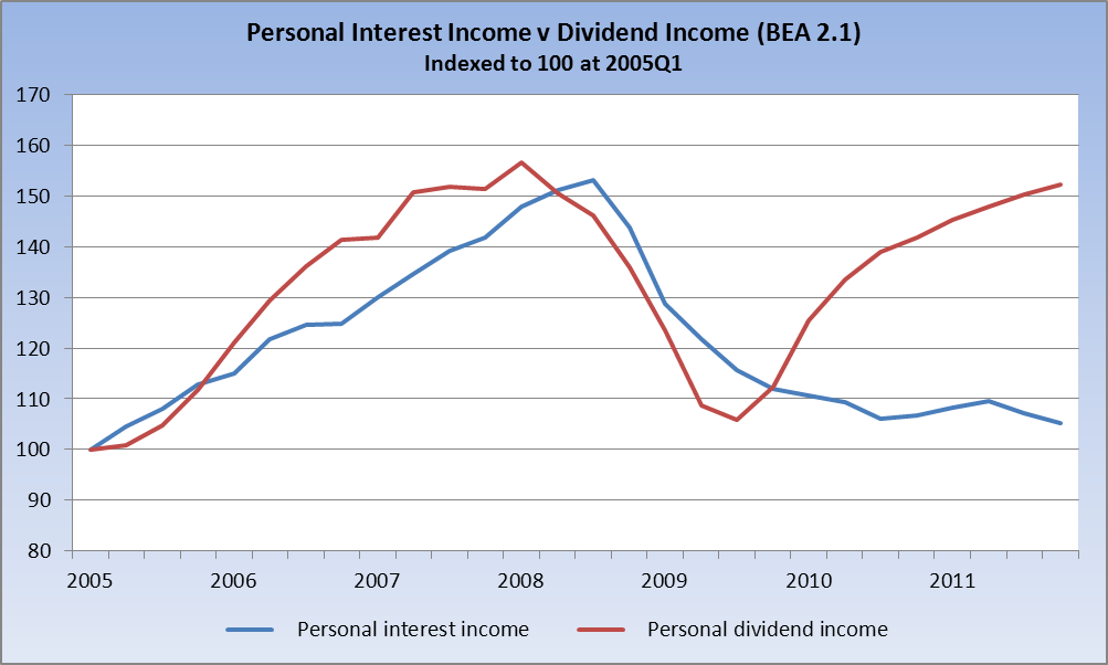
As the Fed has kept interest rates at the zero bound, it has punished savers. Yet those who reap dividend income have now almost fully recovered. From the BEA’s Income and Outlays, we can get a picture of how one group has recovered while the other not so much:
Now, there are many possible reasons that the chart looks as it does. For example, less money in interest bearing accounts (a distinct possibility that I’ve not yet explored) would obviously result in less interest being paid, all else being equal. But the rise in dividend income favors the investor class, and the lack of interest income is clearly a drag on conservative investors who cannot take the risk of more aggressive investments. To be perfectly clear: I am not suggesting a rate rise or criticizing recent Fed policy; I’m simply demonstrating graphically something we all know to be true.
And a Note from Rich Bernstein
Merrill Lynch’s former US Strategist, Rich Bernstein, hung a shingle on his own advisory shop a while back. I’ve always respected Rich and continue to follow his work. His most recent piece [PDF], on the increasing difficulty of truly diversifying, is very interesting.
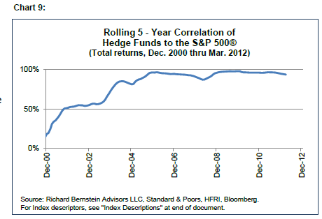
For all the talk about hedge funds, it would seem from Rich’s Chart 9 that perhaps the whole 2/20 setup isn’t providing folks with much (if any) diversification or benefit:
Rich goes through correlations asset class by asset class (some are shocking), and the results are a bit scary. I highly recommend the entire piece.
@TBPInvictus
And a clarification: I should have, but didn’t, run the USPRIV chart from employment troughs; I ran it from NBER troughs of economic activty (i.e. the ends of recessions). It doesn’t matter much in the scheme of things, but it does matter somewhat. I apologize for not being clear on that point, and will run another chart in the near future.


What's been said:
Discussions found on the web: